Saas Product Design
TaskFlow - SaaS Project Management
TaskFlow is a project management SaaS platform built to help teams collaborate, track tasks, and deliver work more efficiently in a single workspace. The design challenge was creating a single-page landing experience that communicated the product's value immediately and guided visitors toward a clear conversion action. The outcome is a focused, visually confident landing page that balances brand presence with functional clarity.
Project Overview
TaskFlow is a team productivity and project management SaaS platform. The design challenge was to create a single-page landing experience that clearly communicates the product's value, guides visitors through key information, and drives sign-ups without overwhelming them. The solution is a focused, dark-themed web page structured around a strong hero, feature highlights, a visual onboarding flow, and a transparent pricing section.
Industry
SaaS - Project Management and Team Productivity
Platform
Web - Single Page Landing
My Role
UI/UX Designer - end-to-end visual design and layout for the landing page
Tools Used
Figma
Problem Statement
Most SaaS landing pages either overload visitors with feature lists or fail to communicate how the product actually works. Teams evaluating productivity tools need to quickly understand the core workflow, trust the pricing, and feel confident enough to start a free trial - all within a single scroll.
Project Goals
Communicate the product's core value proposition within the hero section
Guide visitors through how the product works using a visual step-by-step flow
Present pricing tiers clearly with a recommended plan highlighted
Drive two clear conversion actions - free trial signup and demo viewing
Maintain a consistent, professional visual identity throughout
Target Users
Small to mid-sized teams and team leads actively evaluating project management tools. Assumption: visitors are likely comparing multiple SaaS products and need to quickly assess fit, pricing, and ease of use before committing to a signup.
Design Process
I started by mapping the key decisions a landing page visitor makes - from understanding the product to evaluating pricing. From there, I structured the page to answer those questions in sequence: what is it, how does it work, what does it cost, and how do I get started. Visual design and component choices were made to support scannability and conversion intent throughout.
Information Architecture
The single page follows a top-down narrative: Hero - Features Preview - How It Works - Pricing - Call to Action. The top navigation provides quick access to Features, Pricing, and Contact, allowing returning visitors to jump directly to the section most relevant to them.
Key Features
Hero Section with Dual CTAs
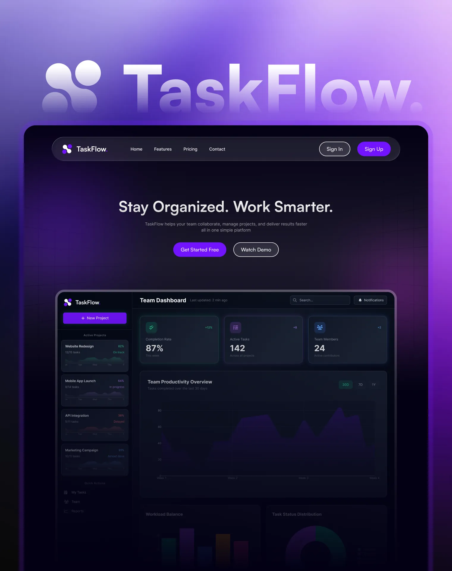
The hero leads with a direct value statement and presents two actions - "Get Started Free" and "Watch Demo" - accommodating both high-intent and early-stage visitors without forcing a single path.
Embedded Dashboard Preview
A live UI preview of the team dashboard is embedded within the hero section, giving visitors immediate product context without requiring a sign-up or click-through to a separate demo page.
Visual How It Works Flow
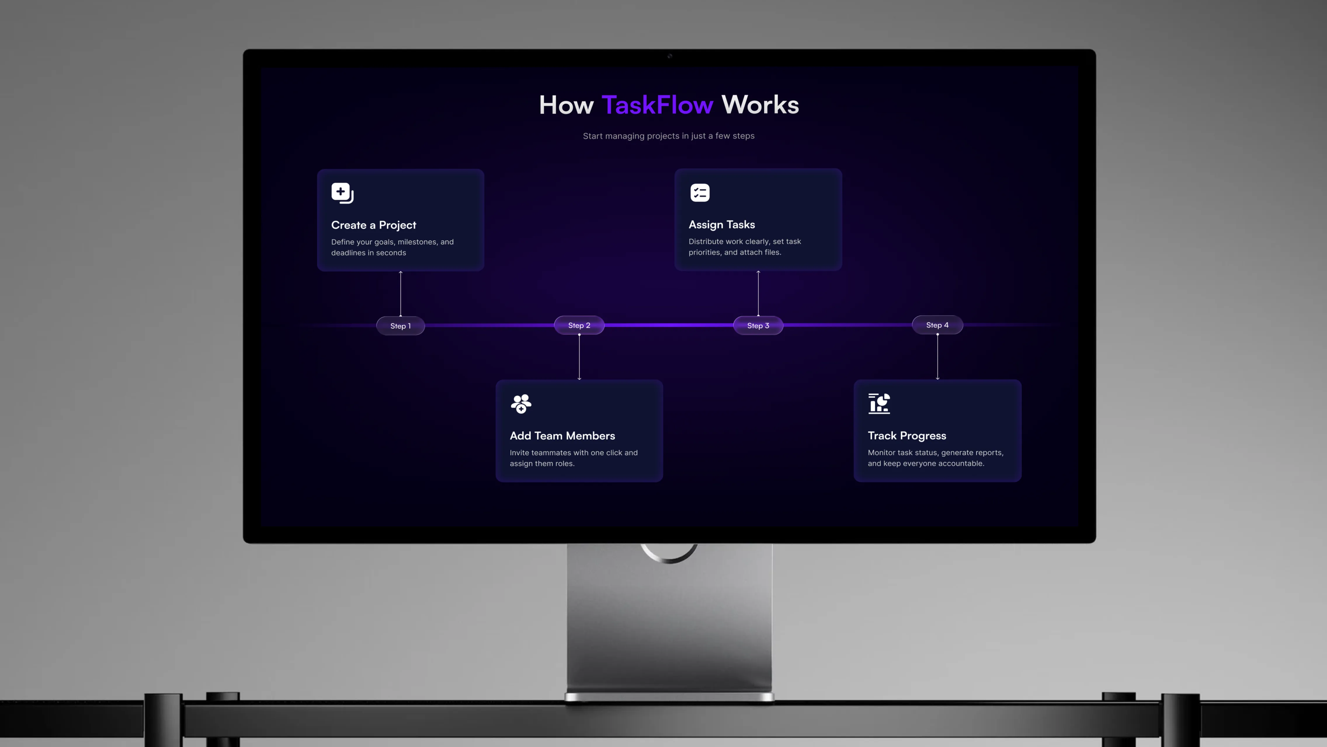
A four-step horizontal flow - Create a Project, Assign Tasks, Add Team Members, Track Progress - uses iconographic cards connected by a timeline to make the onboarding process feel simple and approachable.
Tiered Pricing with Recommended Plan
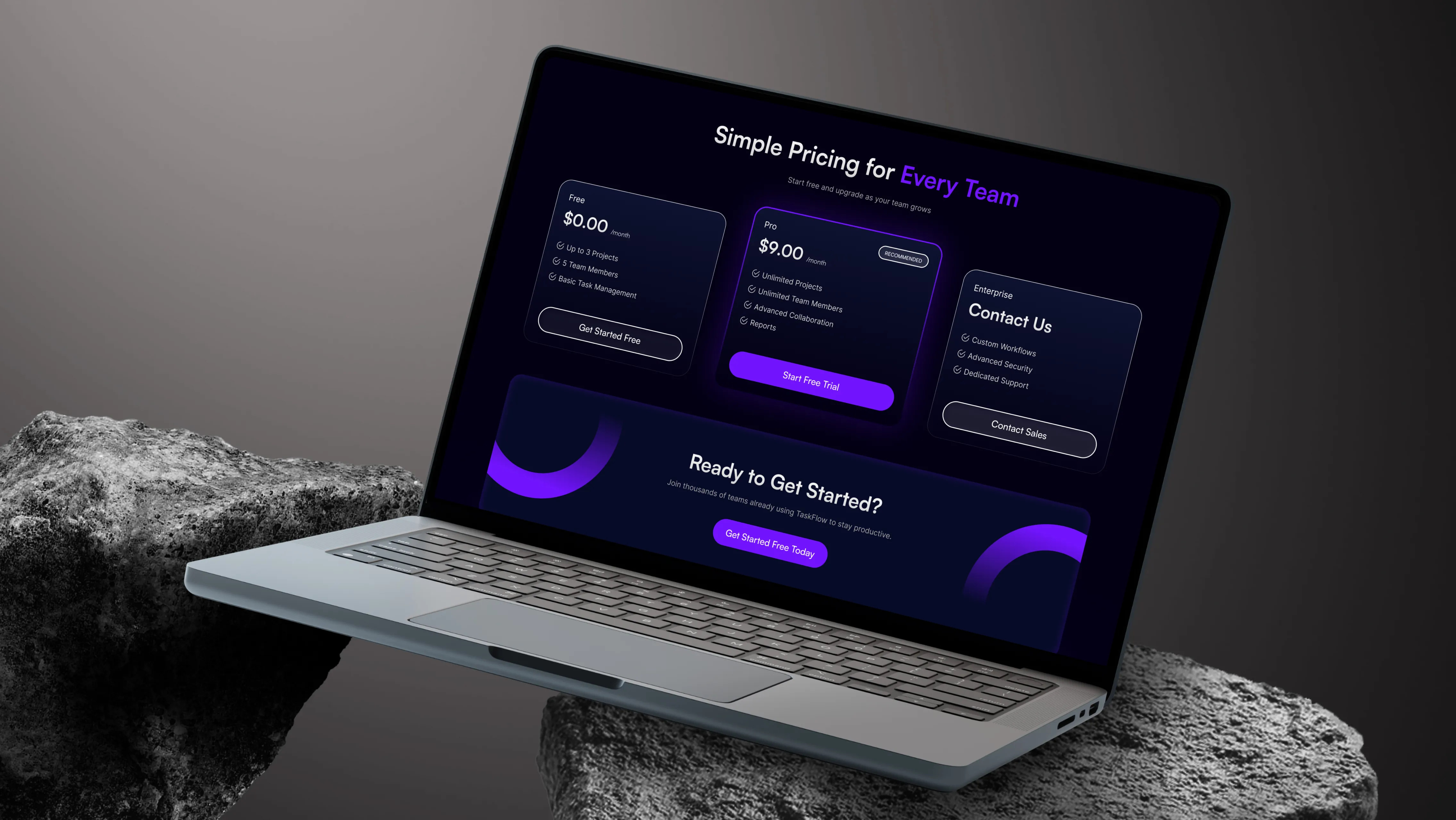
Three pricing tiers - Free, Pro, and Enterprise - are presented side by side. The Pro plan is visually highlighted as recommended, using a distinct card treatment to guide decision-making without applying pressure.
UX Decisions
The dark background with purple accent color creates strong visual contrast that keeps the interface focused and positions the product as a modern, technical tool. Dual CTAs in the hero respect different visitor intent levels - some are ready to sign up, others need more context first. The embedded dashboard preview removes ambiguity about what the product looks like in use. The pricing section avoids hidden details, listing features per tier clearly to reduce hesitation at the decision stage.
Visual Design
The color system uses a deep navy and near-black base with a vibrant purple as the primary accent - applied to CTAs, highlights, and interactive elements. This palette establishes a modern SaaS aesthetic while maintaining strong contrast for readability. Typography is bold and display-forward in headings, shifting to lighter weight body copy for descriptions, which creates a clear and consistent visual hierarchy. The purple gradient glow used in background sections adds depth without distracting from the content.
Challenges and Solutions
Challenge 1 - Communicating Product Value Without Overwhelming Visitors
A single landing page must inform, persuade, and convert in one scroll. The solution was strict content hierarchy - one idea per section, supported by a visual or interactive element that reinforces the message rather than repeating it in text.
Challenge 2 - Making the Pricing Section Feel Trustworthy
Pricing pages often create hesitation if tiers feel unbalanced or unclear. The recommended badge on the Pro plan, combined with a transparent feature list per tier, gives visitors the comparison context they need to make a confident decision.
Accessibility Considerations
High-contrast white and light gray text against dark backgrounds for readability
Purple accent color used consistently to signal interactivity across CTAs and links
Clear typographic hierarchy between headings, subheadings, and body copy
Adequate spacing between pricing cards and feature lists for easy scanning
Distinct button styles differentiate primary and secondary actions visually
Outcome
TaskFlow's landing page delivers a clear, conversion-focused experience that takes a visitor from first impression to pricing consideration in a single scroll. The dark visual identity feels consistent with the product's team-focused positioning, and the structured content flow reduces cognitive load at every stage - from understanding the product to evaluating cost to deciding on a plan.
Key Learnings
A single-page design demands strict information hierarchy - every section must earn its place in the scroll
Embedding a product preview within the hero is more persuasive than describing features in bullet points alone
Highlighted recommended tiers reduce decision friction on pricing pages without being manipulative
Consistent accent color usage across CTAs trains the eye and reduces confusion about where to click
Dark UI aesthetics work well for SaaS products but require careful contrast management to stay accessible