Framer Webiste
Renica Cafe: Coffee Shop Website Framer Template
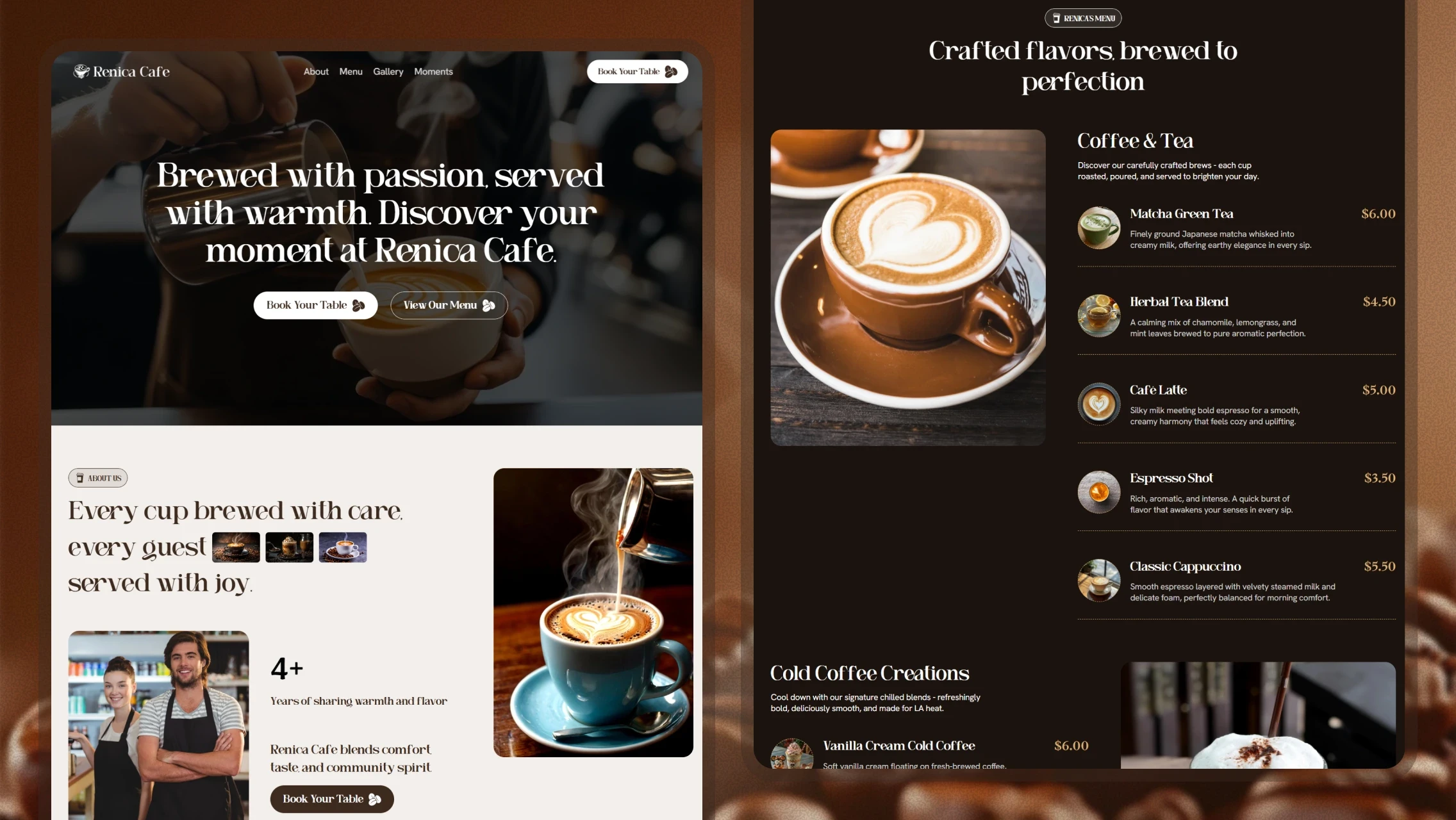
Renica Cafe is a responsive Framer template for coffee shops and cafés. It gives small hospitality businesses a ready-to-launch site with menu display, table booking, and a warm, consistent visual identity.
Project Overview
Industry: Food & Beverage (Hospitality)
Platform: Responsive Web (Framer)
My Role: Product & Template Designer
Tools Used: Framer
Renica Cafe is a self-initiated Framer template created for independent coffee shops that need an affordable, professional web presence. Many small cafés rely on social media alone and lack a structured site. My goal was to package the essentials - brand story, menu, and reservations - into a scalable, easy-to-customize template that non-technical owners can publish and edit without design or development support.
Problem Statement
Independent cafés often lack a dedicated website, making it harder for customers to view menus, prices, and hours or reserve a table. Existing templates are either overly generic or too complex to edit. Owners need a focused, on-brand starting point that communicates atmosphere and makes core actions easy to find.
Project Goals
Provide a launch-ready template covering the core needs of a café site.
Present the menu in a clear, scannable, price-visible format.
Make table booking a primary, easy-to-reach action.
Keep the design system consistent and simple to customize.
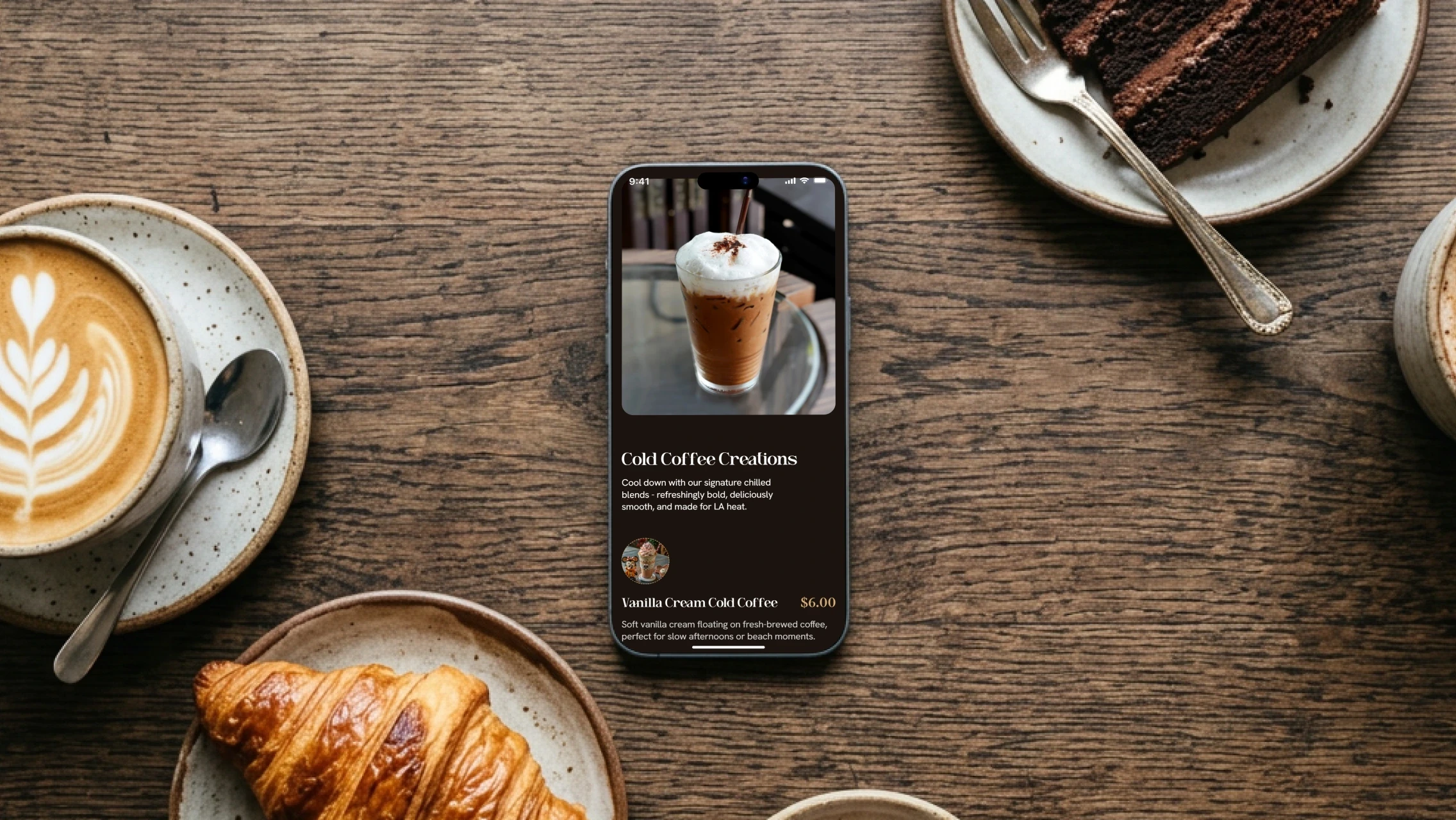
Ensure full responsiveness across mobile and desktop.
Target Users
Two groups use this template: café owners and managers who purchase and customize the template, and their end customers who browse the website to check the menu, hours, and location or book a table. The primary assumption is that end users are local, mobile-first visitors looking for quick information before or during a visit.
Design Process
I began by mapping the essential sections a café website needs, drawing on common hospitality patterns. I structured the homepage as a single narrative - hero, story, menu preview, booking, testimonials, and gallery - then built a dedicated full menu page for additional depth. Visual design followed, defining a warm coffee-toned palette and a typography pairing that balances character with legibility. Throughout the process, I prioritized editable, reusable components so template buyers can swap content without breaking the layout or visual hierarchy.
Information Architecture
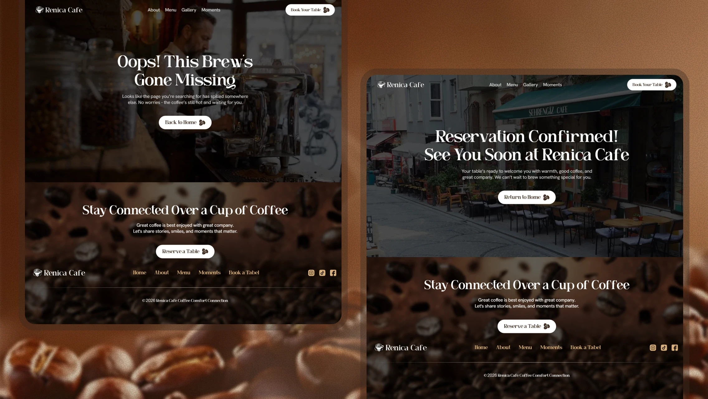
The template uses a shallow, two-page structure consisting of a scrolling homepage with anchored sections (About, Menu, Book a Table, and Moments) and a separate full Menu page. Primary navigation and repeated "Book Your Table" calls-to-action keep the key conversion path accessible from any scroll position, while the homepage serves as a guided overview of the business.
Key Features
Menu Preview & Full Menu Page
A categorized layout with images, names, prices, and short descriptions. The homepage highlights featured items while a dedicated page contains the complete menu, allowing customers to scan offerings quickly without overwhelming the landing page.
Table Booking Form
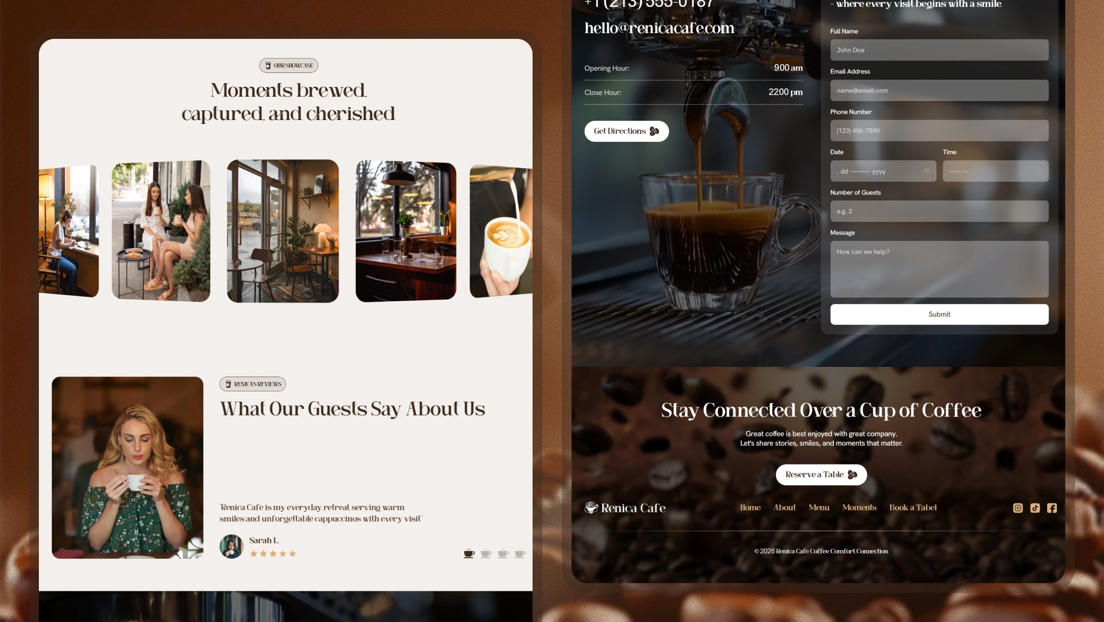
A structured reservation form that captures the customer's name, contact details, date, time, party size, and additional notes. Repeating the booking call-to-action reduces friction and supports the primary business goal of increasing in-person visits.
About & Testimonials
A brand story section combined with guest reviews helps build trust and communicate the café's atmosphere, making it easier for first-time visitors to decide before visiting.
Gallery / Moments
A visual showcase of the café environment and products that highlights ambiance and quality, supporting the emotional and experience-driven nature of café selection.
UX Decisions
I repeated the "Book Your Table" action across the hero section, about section, and footer so the primary task remains accessible regardless of where users stop scrolling. The menu follows a consistent card pattern featuring an image, name, price, and description, ensuring pricing is always visible and content remains easy to scan. Navigation was intentionally kept minimal to match the small content footprint and avoid overwhelming non-technical owners during customization. Section anchors allow the single-page homepage to function as both a storytelling experience and a fast navigation layer.
Visual Design
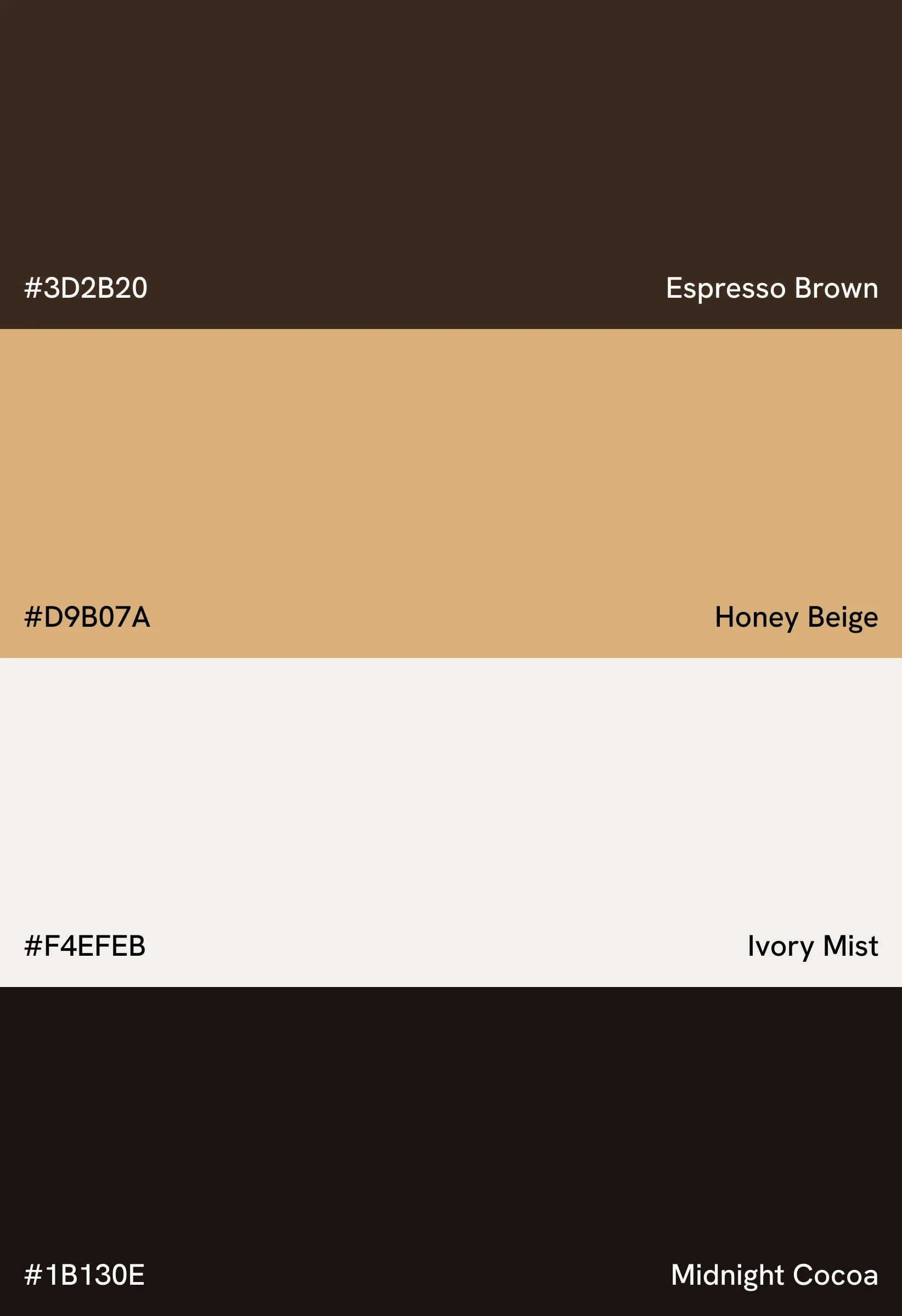
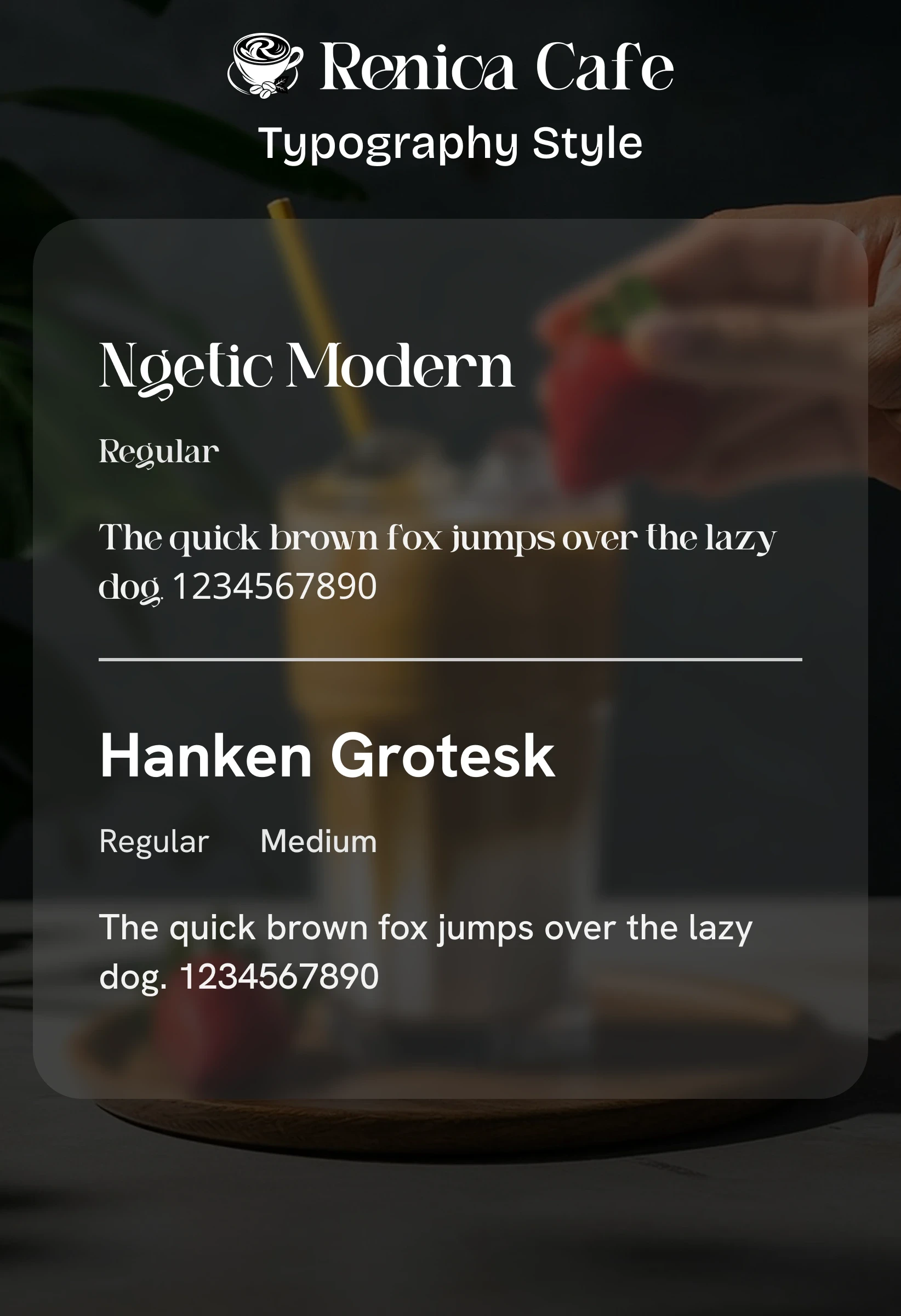
The color palette centers on espresso brown, honey beige, and ivory, reinforcing the coffee theme while maintaining warmth and readability. Typography combines Ngetic Modern for headings with Hanken Grotesk for body text, balancing personality with excellent legibility. Generous spacing and dark, image-focused sections create a calm, premium atmosphere suited to hospitality. Consistent styling across menu items, buttons, and cards keeps the template cohesive and easy to extend as owners update or expand their content.
Challenges & Solutions
Balancing Character with Usability
A decorative serif typeface can reduce readability if overused. To address this, I limited the serif font to headings and paired it with a neutral sans-serif typeface for body copy, preserving brand personality while maintaining clarity.
Serving Buyers and End Users
The template needed to impress café owners while remaining simple to customize. I addressed this by creating repeatable, clearly structured components that require only content updates instead of layout reconstruction.
Accessibility Considerations
High contrast between light text and dark backgrounds in hero and menu sections.
Legible body typography with a clear hierarchy across headings and paragraphs.
Prices displayed as text alongside menu items instead of being embedded within images.
Fully responsive layouts that adapt cleanly to mobile devices.
Consistent and predictable button styling for interactive elements.
Outcome
The result is a cohesive, responsive café template that gives small businesses a structured web presence from day one. Core tasks such as viewing the menu with prices and booking a table are prioritized and easy to access. The consistent design system and editable components make the template practical for non-technical owners to launch and maintain, while the warm visual identity effectively communicates the café's atmosphere.
Key Learnings
Designing for template buyers requires prioritizing editability as much as visual appeal.
Repeating the primary call-to-action significantly improves task accessibility on long pages.
A restrained typography and color system can create a strong brand identity without compromising clarity.
In future iterations, I would add optional pre-built layout variations to increase the template's flexibility.