Mobile App Design
Havn - Hotel Booking App
Havn is a hotel booking mobile app designed for travelers who want a clear, efficient, and trustworthy way to find and book their next stay. The app addresses the most frustrating pain points in existing booking platforms - opaque pricing, cluttered search experiences, and multi-step checkout - by replacing them with a focused, user-centered flow. The outcome is a polished, scalable mobile product that puts confidence and clarity at the center of every interaction.
Project Overview
Havn is a hotel booking mobile app designed to simplify how travelers discover and book stays worldwide. The core design challenge was addressing the friction points that frustrate users in existing booking platforms - cluttered search experiences, hidden pricing, and multi-step checkout flows. The solution focuses on progressive disclosure, transparent pricing, and a clean, gallery-first interface that keeps the user's attention on what matters.
Industry
Travel and Hospitality
Platform
iOS Mobile App
My Role
UI/UX Designer - end-to-end design including user flows, wireframing, visual design, and design system
Tools Used
Figma
Problem Statement
Existing hotel booking apps overwhelm users with dense filter menus, bury pricing details until checkout, and rely on low-quality images that fail to communicate the actual property experience. These patterns erode user trust and increase drop-off during the booking journey.
Project Goals
Simplify the search and filter experience using progressive disclosure
Display all-inclusive pricing at every stage to build trust
Create a gallery-first hotel detail page for richer property exploration
Reduce booking flow to three clear steps
Design a consistent, accessible UI system that scales across screens
Target Users
Frequent and occasional travelers who book hotels via mobile - including solo travelers, couples, and business travelers. They value clarity, speed, and honest pricing. They're familiar with apps like Booking.com or Airbnb but frustrated by their complexity.
Design Process
I began by analyzing friction patterns in existing booking platforms and mapping the key moments where users drop off. From there, I structured user flows around three core journeys: discovery, property evaluation, and checkout. Wireframes were iterated to validate layout hierarchy before moving into high-fidelity UI and a structured design system covering color, typography, and components.
Information Architecture
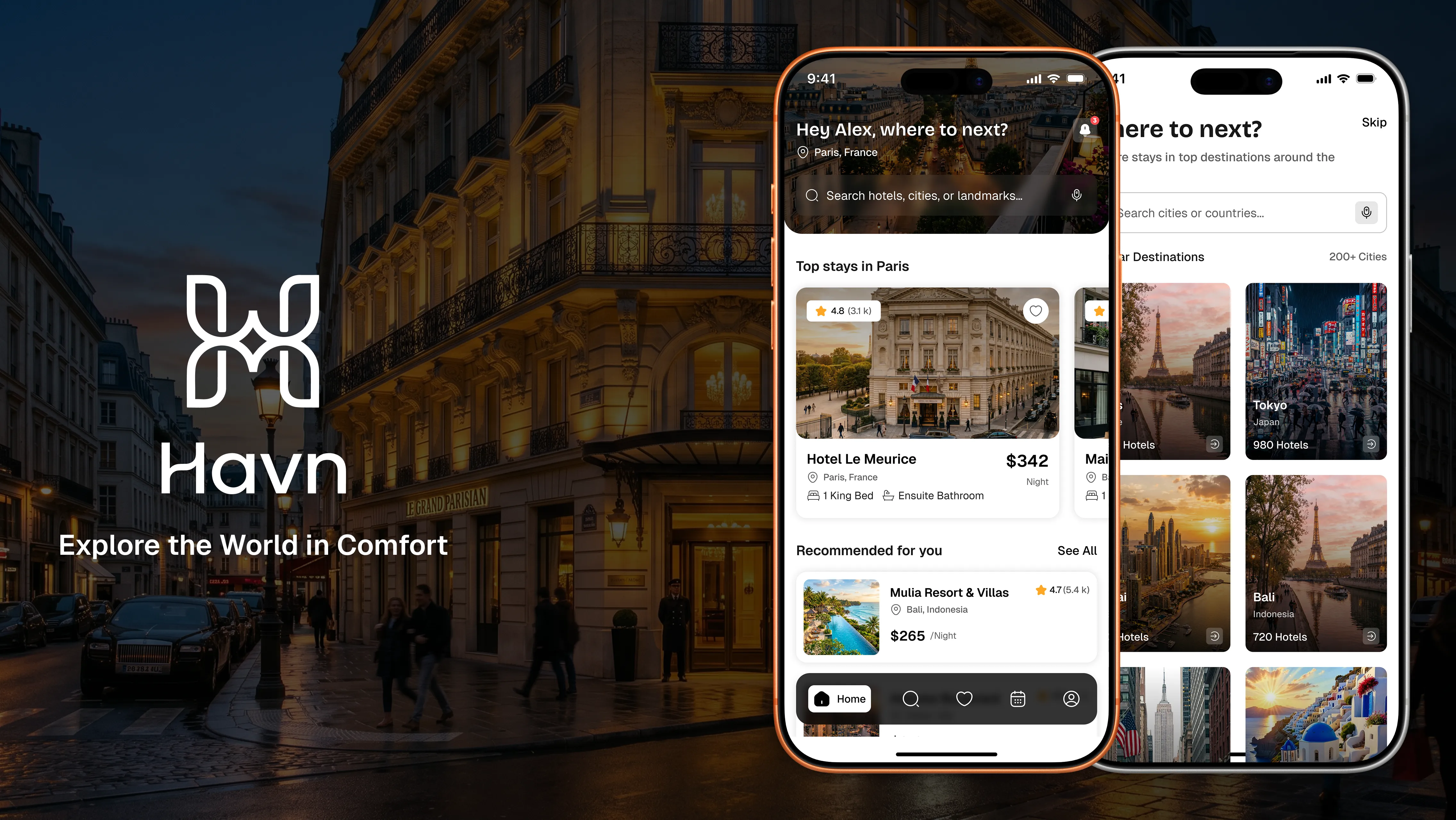
The app is organized around five primary destinations accessible via bottom navigation: Home, Search, Saved, Bookings, and Profile. The home screen leads with personalized recommendations and location-aware content. Search leads into filtered listings, then a detail page, and finally a three-step booking flow.
Key Features
Smart Search with Progressive Filters
Basic filters - price, rating, and distance - are shown upfront. Advanced filters are accessible under a secondary action, reducing cognitive load for first-time and casual users.
All-Inclusive Pricing Display
Every listing displays the final price inclusive of taxes and service fees. A collapsible breakdown drawer is available for users who want full transparency - addressing one of the most common trust issues in booking apps.
Gallery-First Hotel Detail Pages
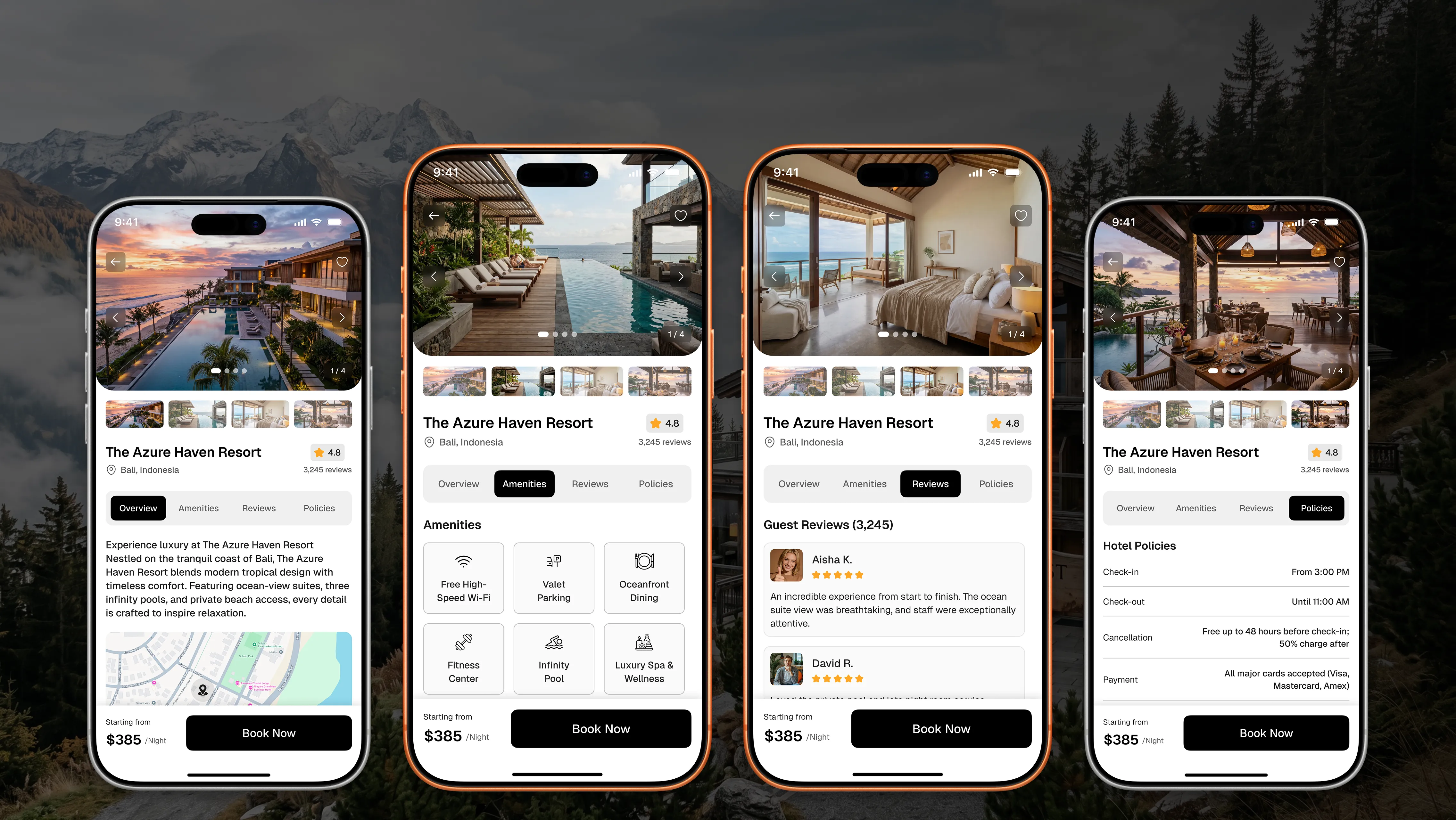
Property detail pages lead with a full-width scrollable image gallery. A tabbed layout - Overview, Amenities, Reviews, Policies - allows users to access layered information without scrolling endlessly through a single page.
Three-Step Booking Flow
The checkout experience is compressed into three steps: Choose Room - Guest and Payment Info - Confirm Booking. Profile data and saved payment methods auto-populate to minimize repetitive input.
UX Decisions
The bottom navigation provides immediate access to core tasks without burying key sections in hamburger menus. Personalized greetings and location-aware home screen content reduce the time from open to first useful result. The tabbed detail page structure separates information types clearly, allowing users to scan and access what's relevant without losing context. The "Book Now" CTA remains persistent and visible throughout the detail view, reducing the need to scroll back to initiate a booking.
Visual Design
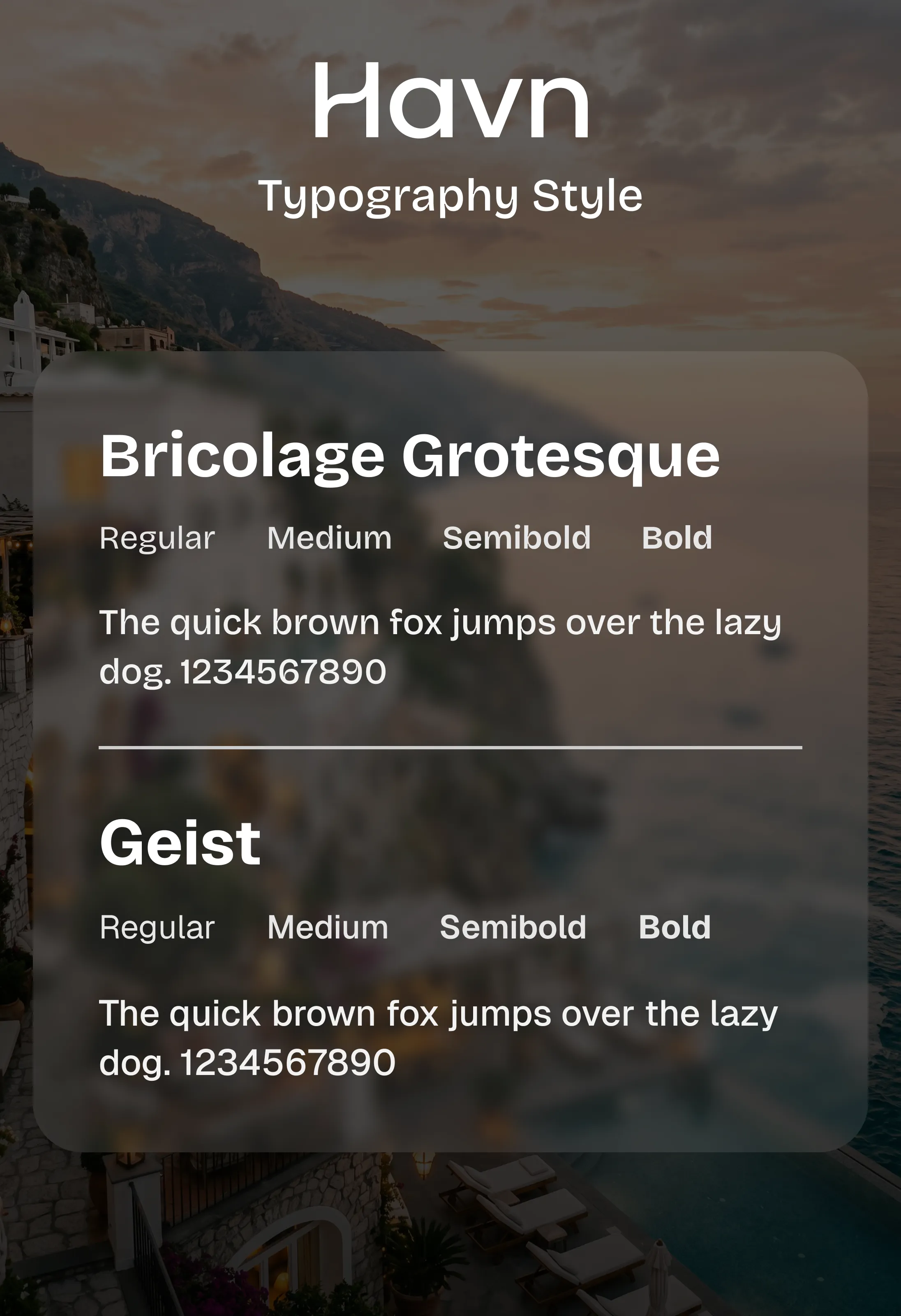
Havn uses a black-and-white primary palette with a structured gray scale (Gray 50 through Gray 900) to maintain a clean, editorial aesthetic that keeps property imagery as the focal point. An amber accent is used sparingly for ratings and interactive highlights. Typography is set in Bricolage Grotesque for display and headings - adding warmth and personality - paired with Geist for body text and UI labels, which ensures high readability at small sizes. Spacing and component sizing follow consistent 8px increments to maintain rhythm across all screens.
Challenges and Solutions
Challenge 1 - Balancing Pricing Transparency with Visual Simplicity
Showing full pricing without cluttering listing cards required a layered approach. The listing card shows the final price prominently; a drawer within the detail page handles the breakdown. This keeps the scan experience clean without hiding information.
Challenge 2 - Designing a Booking Flow That Feels Fast Without Skipping Steps
Compressing checkout to three steps while collecting all necessary information required prioritizing auto-fill from user profiles and saved cards. The form screens are structured to group related fields clearly and reduce perceived effort.
Accessibility Considerations
High-contrast text on white surfaces using Gray 800 and Gray 900 for body copy
Touch targets designed at a minimum 44px height for primary interactive elements
Icon-label pairs used throughout navigation and amenity grids for clarity
Sufficient spacing between list items and form fields to reduce accidental taps
Rating stars accompanied by numeric scores for users with color perception differences
Outcome
Havn delivers a focused hotel booking experience built around the needs of travelers who value speed and honesty. The design addresses the most common pain points in the category - hidden fees, cluttered interfaces, and slow discovery - through systematic UX decisions rather than cosmetic changes. The end result is a product that feels considered, trustworthy, and efficient from first open to booking confirmation.
Key Learnings
Progressive disclosure is one of the most effective tools for reducing perceived complexity without reducing functionality
Trust is built through consistency - predictable pricing behavior across every screen matters more than any single feature
A well-structured design system early in the project makes iteration significantly faster
Gallery-first layouts work best when paired with a clear information architecture that does not rely on scrolling depth alone
Auto-fill and saved preferences are not just convenience features - they are critical friction reducers in transactional flows