Framer Webiste
FitSiq: Gym Website Framer Template
FitSiq is a premium multi-page Framer website template designed for gyms, fitness studios, and personal trainers. Built with a bold dark theme and vibrant accents, it delivers a complete web presence across five essential pages. The template combines strong visual branding, clear membership and program layouts, responsive design, and easy customization, helping fitness businesses launch professionally with minimal effort.
Project Overview
FitSiq is a multi-page Framer website template built for gyms, fitness studios, and personal training brands. The design challenge was to create a ready-to-launch web presence that feels premium and brand-forward while remaining easy for gym owners to customize and go live with. The solution is a five-page dark-themed template covering the full customer journey - from first impression to membership inquiry.
Industry
Health, Fitness, and Wellness
Platform
Web - Framer Template (Multi-Page)
My Role
UI/UX Designer and Framer Developer - end-to-end design and template build
Tools Used
Framer
Problem Statement
Gym owners and fitness studios often lack the time, budget, or technical resources to build a professional web presence from scratch. Generic website builders produce layouts that feel misaligned with the energy and identity of fitness brands. There was a clear need for a purpose-built, visually strong template that requires minimal setup and no design expertise to launch.
Project Goals
Design a template that communicates gym brand identity immediately on landing.
Cover all key pages a fitness business needs - Home, About, Programs, Trainers, and Contact.
Make membership plans and program offerings easy to scan and compare.
Provide a consistent visual system that gym owners can personalize without breaking the design.
Ensure the layout works cleanly across all screen sizes.
Target Users
The primary user of this template is a gym owner, fitness studio founder, or personal trainer looking to launch or refresh their web presence quickly. Most users are non-designers who need a polished, content-ready structure they can update with their own text, images, and branding.
Design Process
I started by mapping the five core pages a fitness business needs and identifying what content each page must communicate. Page structures were planned around visitor intent. Someone on the Home page is exploring, while someone on the Contact page is ready to act. Visual design followed, building a cohesive dark system with a lime green accent that works consistently across all pages without requiring custom design work per page.
Information Architecture
The site is structured across five pages: Home, Our Story, Programs, Trainers, and Contact. The top navigation remains fixed across all pages for easy movement between sections. The Home page functions as a hub, introducing the brand, highlighting programs, showcasing trainers, displaying pricing tiers, and leading into an FAQ and newsletter section.
Key Features
Full Hero Sections per Page
Each page opens with a full-width image hero, a bold headline, a supporting subline, and a primary CTA. This gives every page its own entry point and keeps the brand energy consistent whether a visitor lands on Home or Programs directly.
Programs Grid with Clear Categories
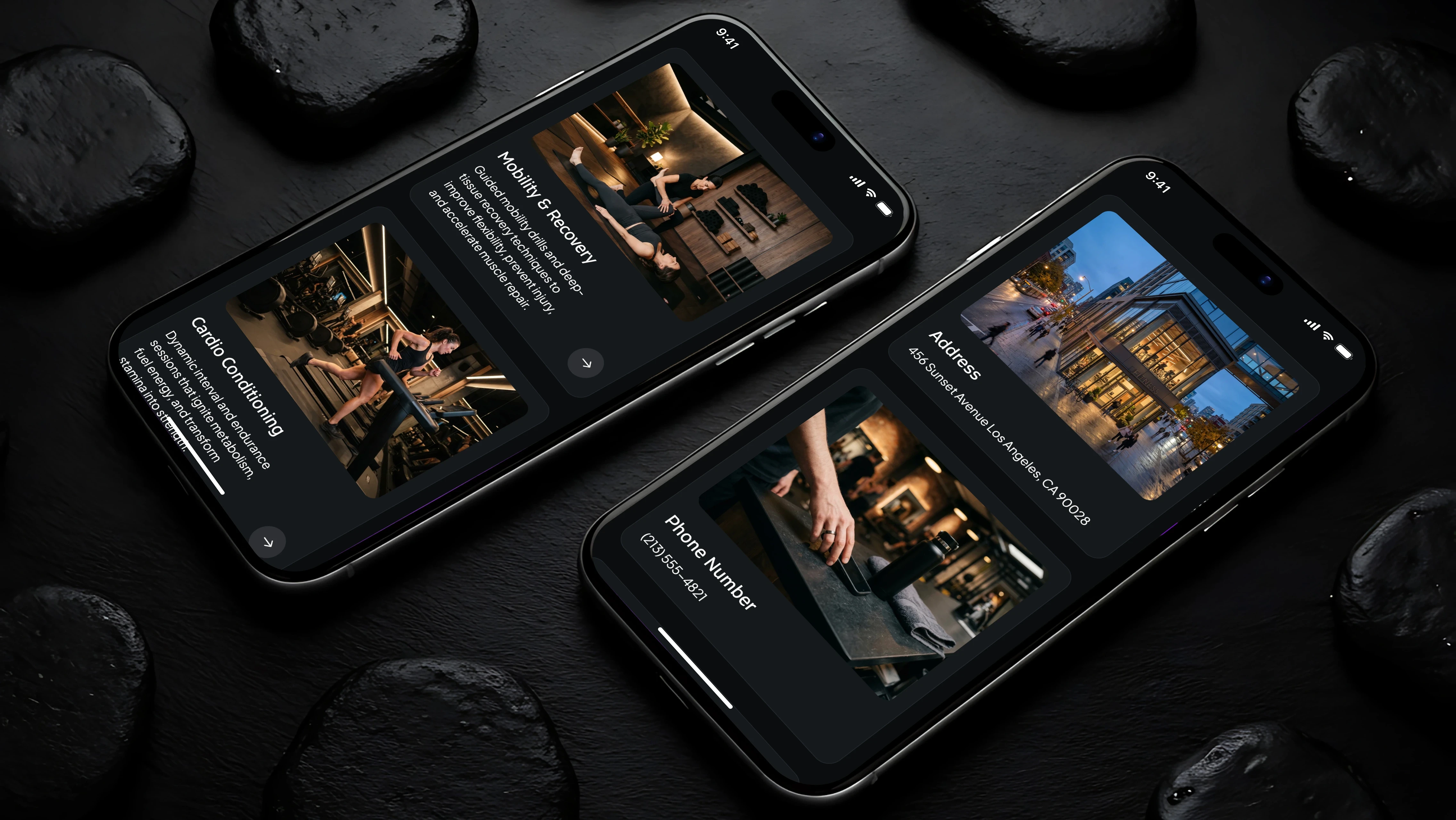
Six programs - Group Training, Personal Coaching, Mobility and Recovery, Cardio Conditioning, Elite Performance, and Training Programs - are displayed in an image-led grid with brief descriptions and navigation arrows, making it easy to scan and explore.
Trainer Roster with Role Labels
Nine trainers are presented in a uniform photo grid with name and specialty visible at a glance. A philosophy section above the grid provides brand context before introducing individual team members.
Tiered Membership Plans
Three membership levels - Foundation, Pro Athlete, and Champion - are presented with pricing, included features, and a highlighted "Most Popular" indicator. This layout makes plan comparison straightforward without requiring the visitor to dig for information.
UX Decisions
The fixed navigation with a high-contrast "Join Now" CTA button ensures the primary conversion action is always accessible regardless of scroll depth. Each page follows the same structural rhythm - hero, context section, content grid, newsletter strip, footer - which reduces cognitive load for visitors moving between pages.
The FAQ section on the Home page is positioned after testimonials, using social proof to build trust before addressing objections. Contact information is surfaced both in dedicated cards and in the footer to reduce friction for visitors ready to reach out.
Visual Design
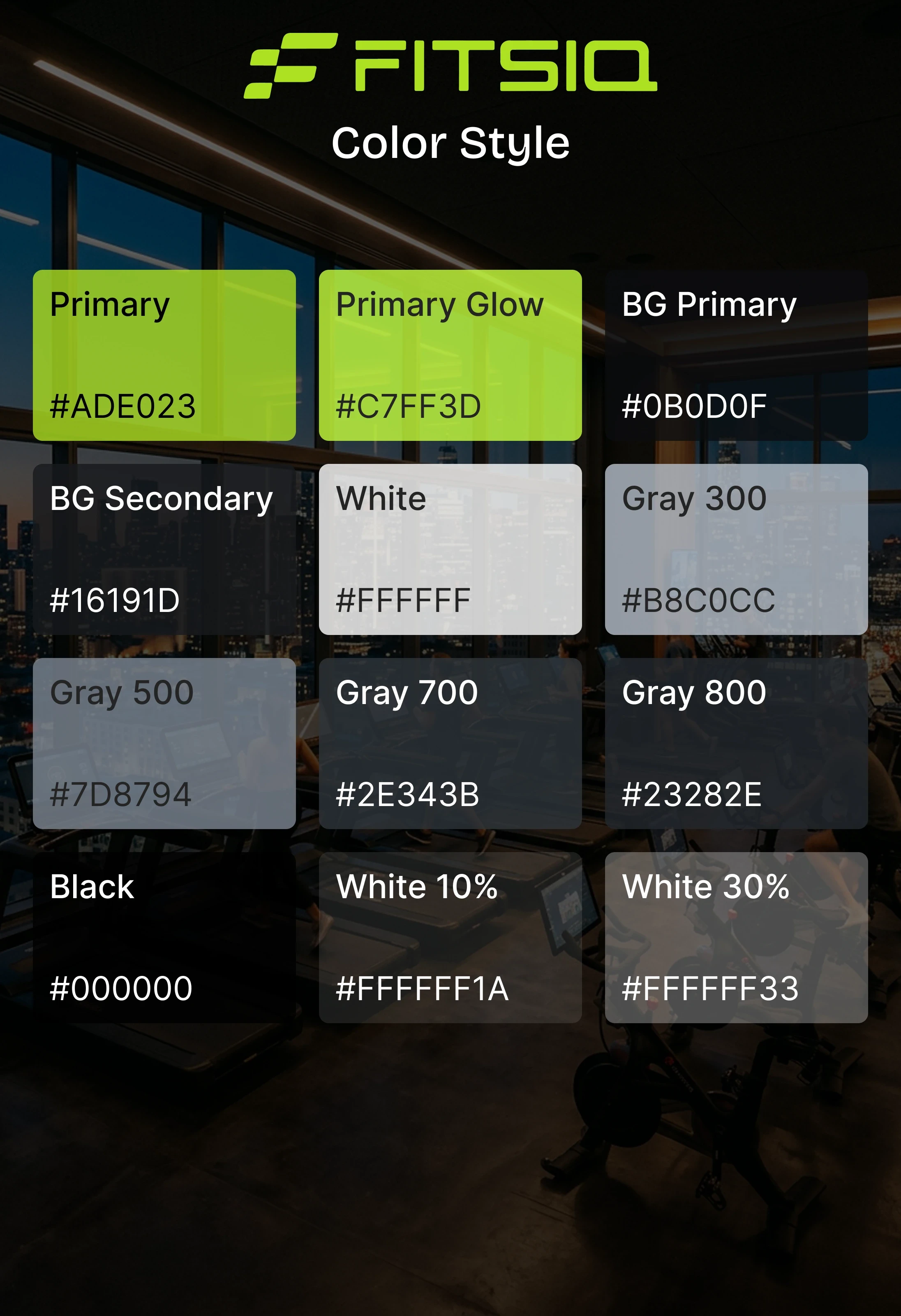
The color system is built around a near-black background (#0A0A0A range), white body text, and a lime green accent used for logos, CTAs, and interactive highlights. This combination creates strong contrast and gives the brand a modern, performance-focused identity.
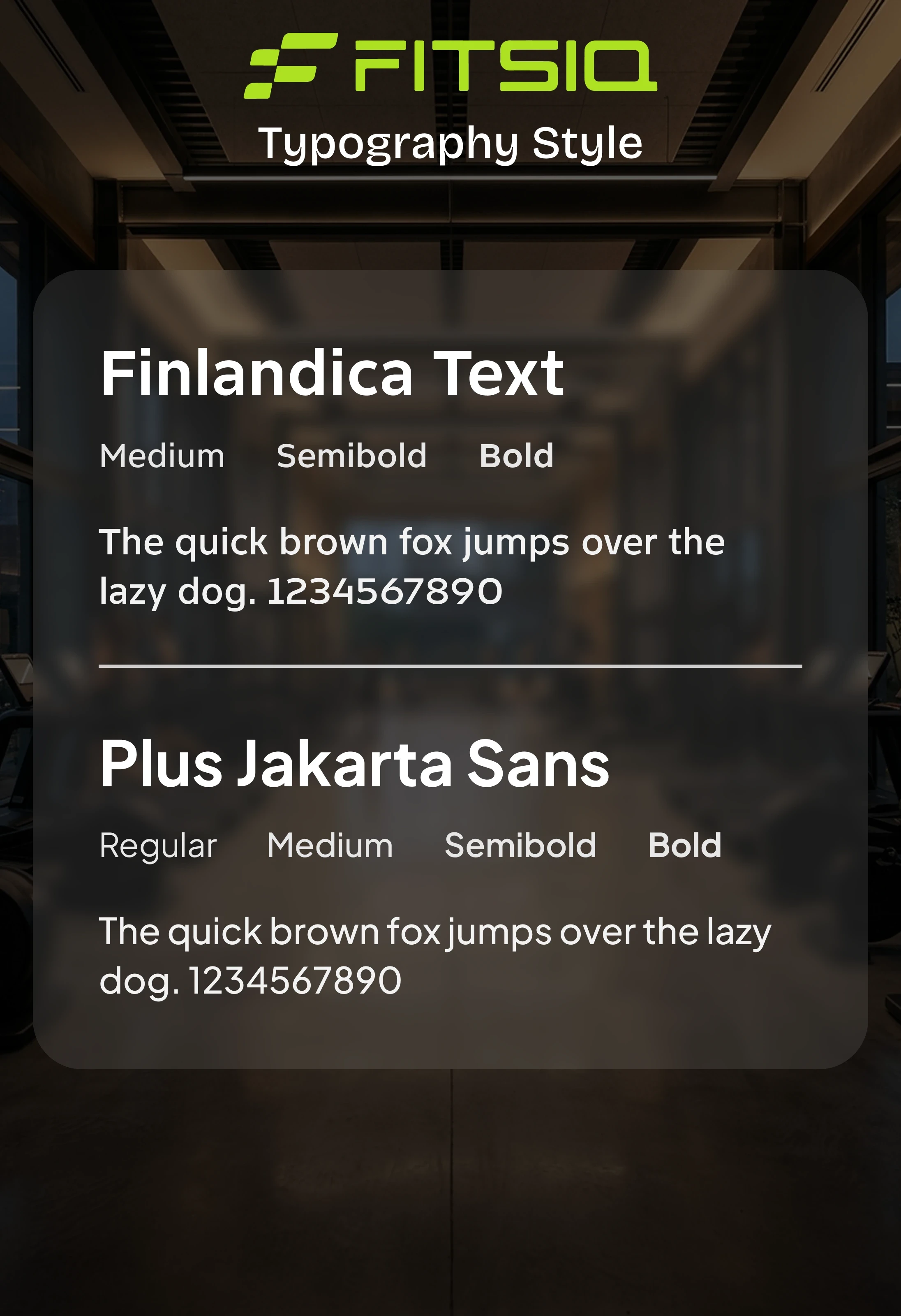
Photography plays a central role. Full-bleed gym imagery in hero sections and program grids communicates atmosphere and energy more effectively than copy alone. Typography uses a bold, condensed style for headings and a clean sans-serif for body text, maintaining hierarchy and readability at all sizes.
Challenges and Solutions
Challenge 1 - Designing for an Unknown Client's Brand
A template must feel specific enough to be aspirational but flexible enough to be customized. The solution was building the visual identity around neutral but strong foundations - dark backgrounds, clean grids, and a single accent color - so any gym can swap in their own logo, colors, and photos without structural redesign.
Challenge 2 - Fitting Five Pages Into a Consistent System
Each page serves a different purpose but must feel like one cohesive product. Establishing a shared section template - hero, label tag, content block, newsletter strip, footer - across all five pages solved this and made the template feel intentional rather than assembled.
Accessibility Considerations
High-contrast white and lime green text against dark backgrounds for readability.
Bold, large heading sizes maintain hierarchy clarity at a glance.
CTA buttons are consistently sized and styled for easy tap and click targets.
Contact information is presented in multiple locations to reduce search effort.
Alt-text ready image structure with clear caption labels for trainer and program photos.
Outcome
FitSiq delivers a complete, launch-ready web presence for fitness businesses that need to look professional without building from scratch. The five-page structure covers every stage of the customer journey, and the dark visual system gives the template a strong, distinctive identity that stands apart from generic fitness website builders.
Gym owners get a product they can personalize and publish with minimal effort.
Key Learnings
Designing for an unknown end user requires building flexibility into every design decision without compromising visual quality.
A shared section rhythm across pages is more valuable than making each page feel unique. It speeds up both design and customization.
Photography choices in a template set the tone as much as typography or color. Selecting strong, on-brand placeholder images is part of the design work.
Framer's component system made it straightforward to maintain consistency while keeping individual pages editable.
A template is a product in itself. It needs to communicate its own value clearly, not just serve as a blank container.