Mobile App Design
CareSync - Telemedicine Mobile App
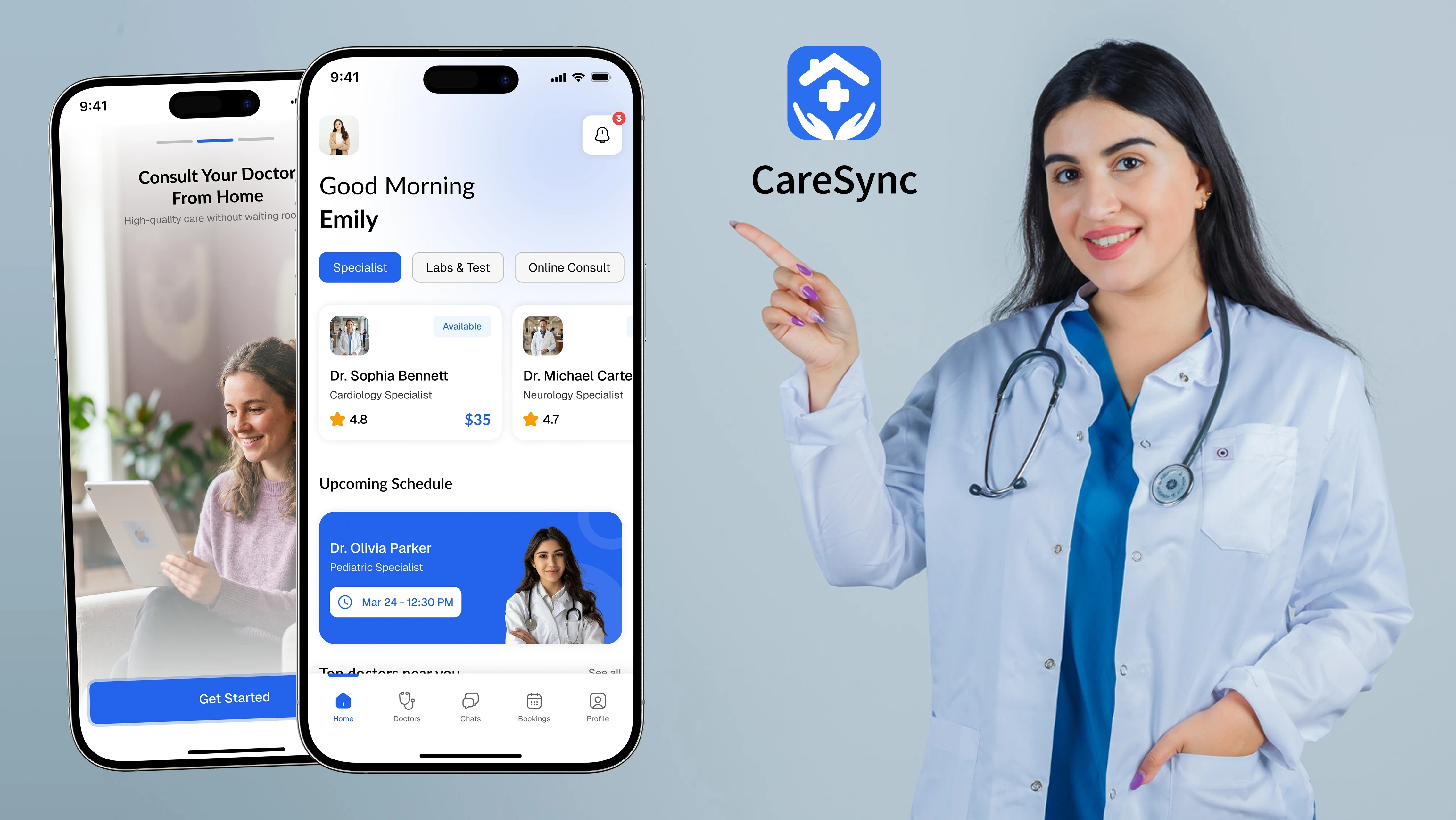
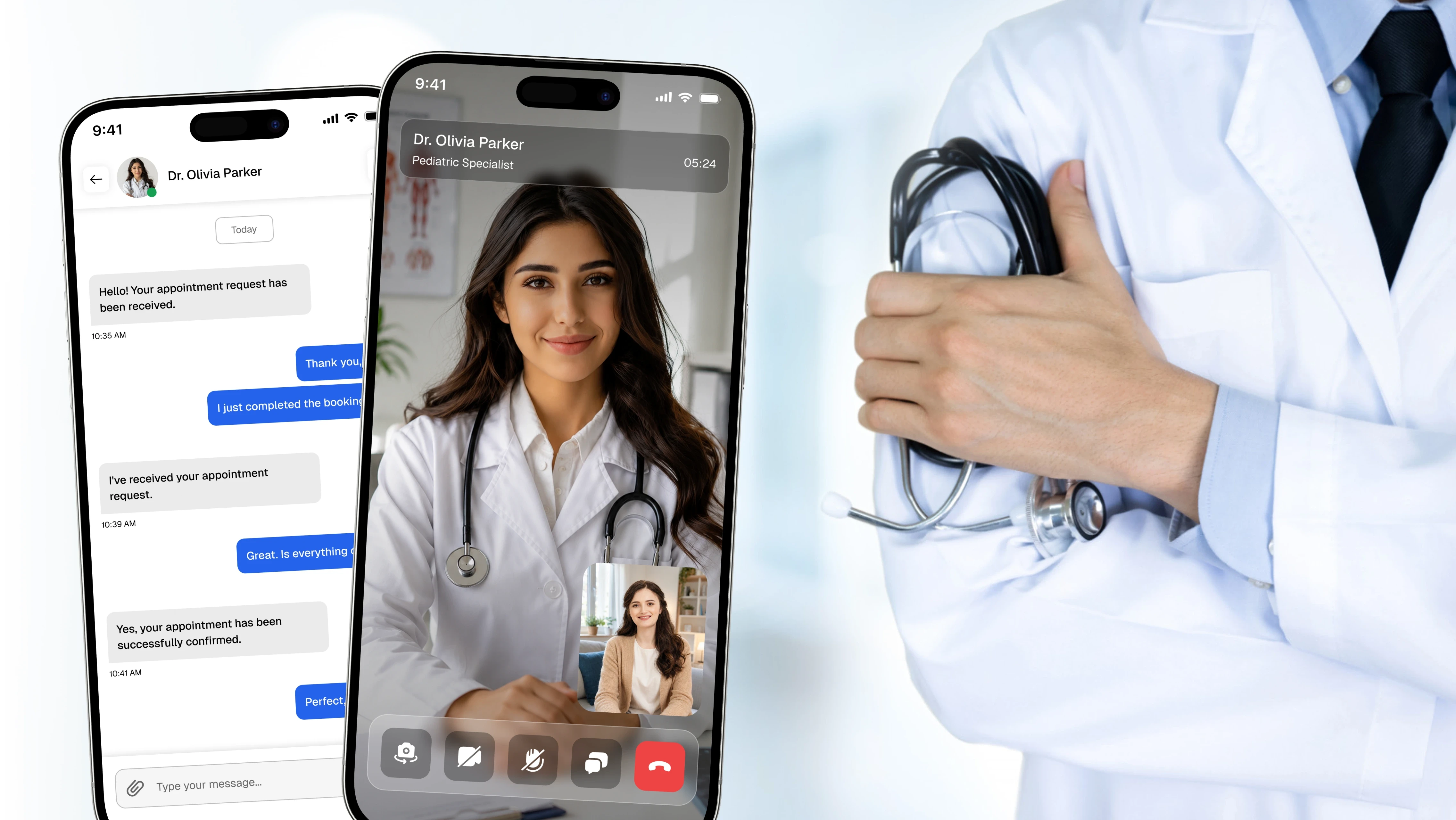
CareSync is a telemedicine mobile app that lets patients browse verified doctors, compare profiles, and book appointments as video consultations or in-clinic visits, reducing friction in accessing timely care.
Project Overview
CareSync helps patients find the right doctor and book care without phone calls or long waits. The core challenge was condensing onboarding, doctor discovery, scheduling, and consultation into a single, low-effort flow. I focused on a clear booking journey, transparent doctor profiles, and consistent components that scale across specialties and appointment types.
Problem Statement
Booking medical care often means phone calls, unclear availability, and limited information about doctors before committing. Patients struggle to compare specialists, find open slots, and choose between remote or in-person visits. This creates delays in care and uncertainty, especially for non-urgent consultations that could be handled remotely.
Project Goals
Simplify doctor discovery with searchable, filterable profiles.
Support both video call and in-clinic booking within one flow.
Provide transparent doctor details, including ratings, fees, and availability.
Reduce booking friction through a guided, step-based process.
Maintain a consistent, scalable design system across all screens.
Target Users
Primarily adults seeking convenient, non-emergency medical care, including busy professionals, parents managing family health, and patients in remote areas with limited clinic access. Users are assumed to have moderate digital literacy and prefer scheduling on mobile over calling clinics, valuing speed, clarity, and the option to consult remotely.
Design Process
I began by mapping the end-to-end patient journey, including onboarding, profile setup, discovery, booking, and consultation. Personalized health onboarding, such as gender, age, weight, and blood type, informs a tailored experience early on. I then structured the booking flow into clear steps including doctor selection, appointment type, and date and time before moving into visual design. Components such as doctor cards, filters, and slot pickers were standardized so the system remains consistent as new specialties and features are added.
Information Architecture
The app follows a tab-based structure consisting of Home, Search/Discovery, Bookings, Chat, and Profile. Home surfaces upcoming appointments and quick categories, while Discovery handles search and filtering. Bookings are organized into Upcoming, Completed, and Cancelled states, giving patients a clear mental model of their care history and current commitments.
Key Features
Doctor Discovery and Filtering
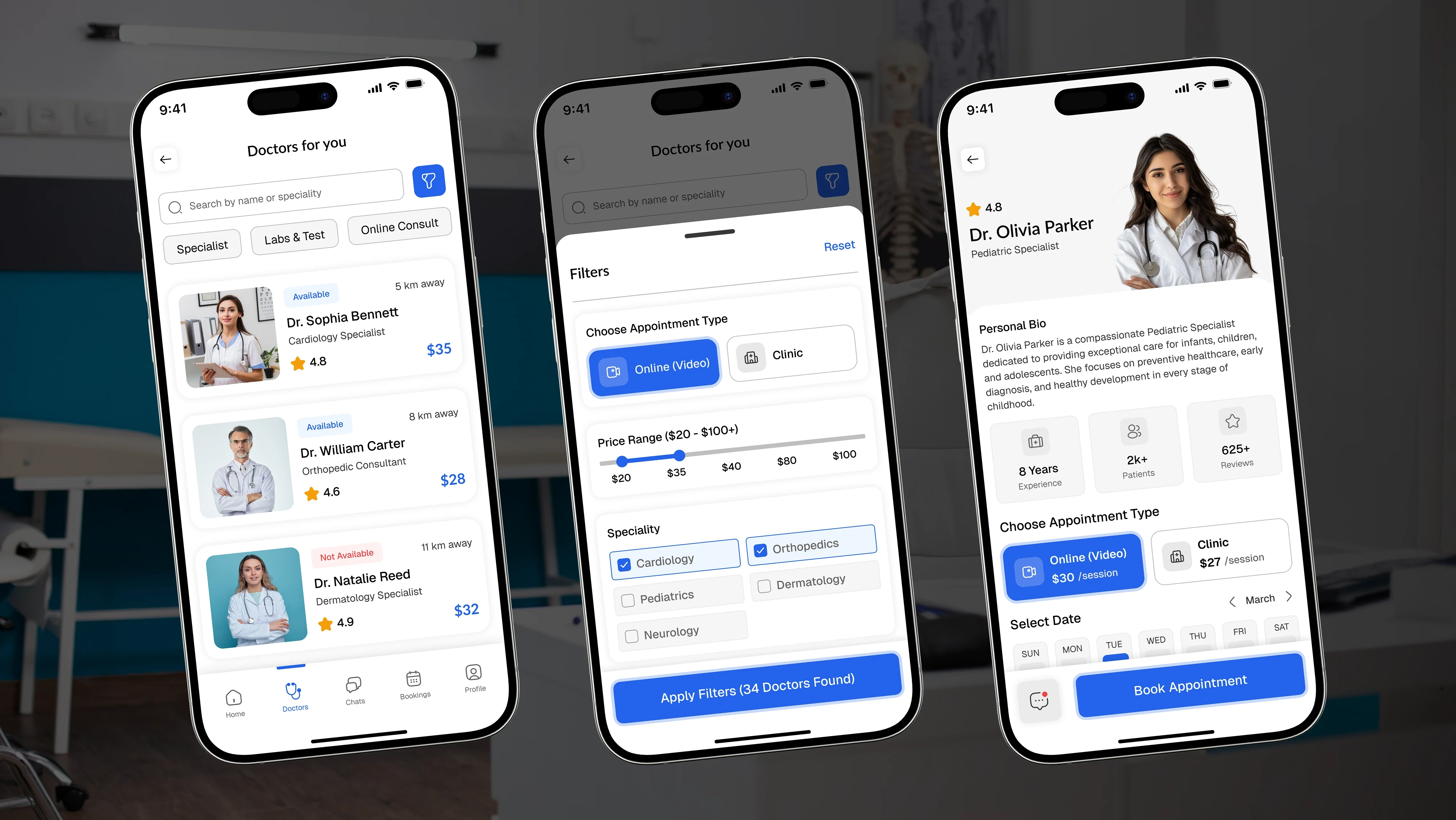
Patients browse profiles by specialty with ratings, fees, and availability visible upfront. Filters and search reduce decision time and help users confidently choose the right doctor.
Dual Appointment Booking
A single flow supports both online video consultations and in-clinic visits. Clear toggles and pricing for each appointment type allow users to choose the format that best fits their needs and budget.
Slot-Based Scheduling
A calendar and time-slot picker display real-time availability at a glance. This removes unnecessary back-and-forth communication and gives patients immediate control over when they receive care.
Booking Management
Upcoming, Completed, and Cancelled tabs allow users to reschedule, rebook, cancel appointments, or leave reviews, keeping the full appointment lifecycle in one accessible place.
UX Decisions
I used a persistent bottom navigation to keep core areas one tap away, reducing cognitive load. The booking flow is broken into discrete, single-decision steps to prevent overwhelm and reduce scheduling errors. Doctor cards prioritize the information patients value most, including ratings, specialty, and consultation fees, enabling faster comparison. Primary blue buttons consistently indicate the next action, creating a predictable flow through onboarding, booking, and confirmation. Status-based tabs within Bookings reuse the same card pattern, reinforcing familiarity and lowering the learning curve.
Visual Design
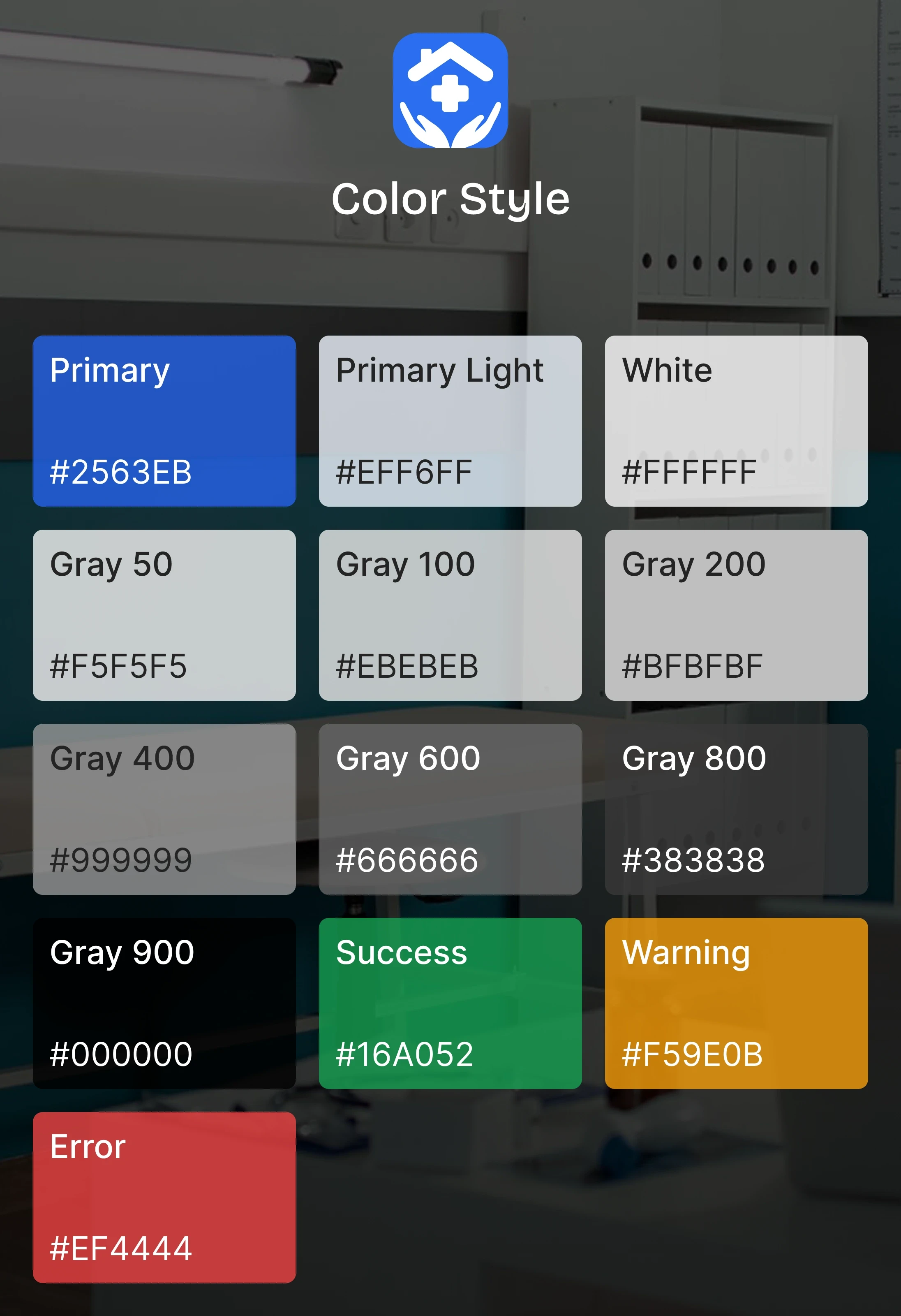
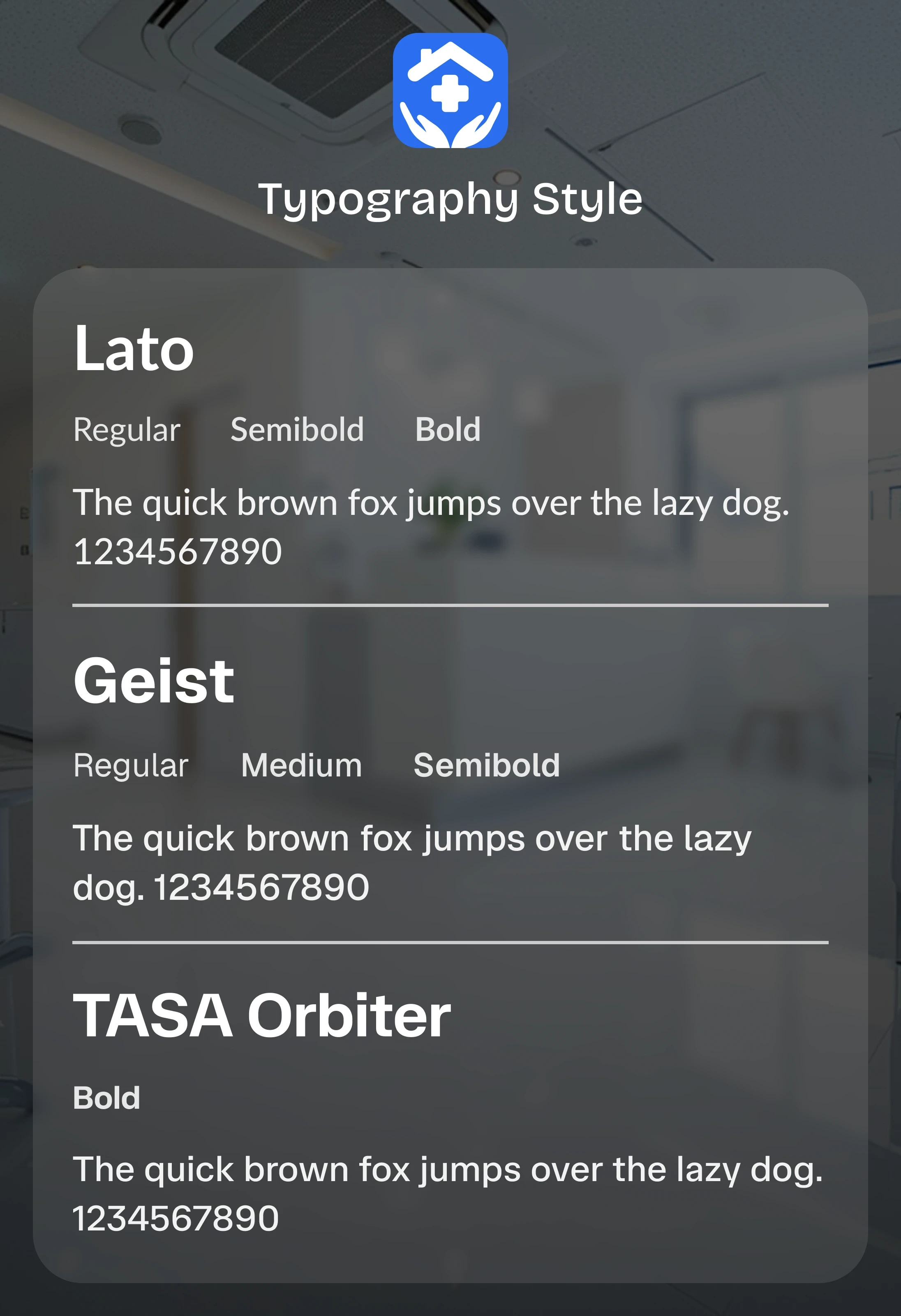
The interface uses a calm blue-and-white color palette that conveys trust and clarity, making it well suited for healthcare. Generous white space and a clean sans-serif typeface keep dense information, such as profiles, fees, and schedules, readable and uncluttered. Visual hierarchy is established through consistent card layouts, clear section headings, and a single accent color for primary actions. Rounded components and uniform spacing create a soft, approachable appearance, while consistent iconography helps users quickly recognize repeated patterns across discovery, booking, and messaging.
Challenges and Solutions
Challenge
Supporting two distinct appointment types without splitting the flow into separate user journeys.
Solution
A unified booking flow with a clear toggle for online and in-clinic appointments keeps the experience familiar regardless of appointment format.
Challenge
Presenting detailed doctor information without overwhelming users.
Solution
Doctor cards prioritize essential details while allowing users to access complete profiles when they need additional information.
Accessibility Considerations
High-contrast blue primary actions against light backgrounds for improved readability.
Large, clearly spaced touch targets for buttons and time slots.
Consistent typographic hierarchy to support quick scanning.
Status labels paired with color rather than relying on color alone.
Generous spacing to reduce accidental taps during scheduling.
Outcome
The final design delivers a streamlined journey from finding a doctor to confirming an appointment. Patients can compare specialists, view transparent pricing, and choose between remote and in-person care within a single guided flow. The consistent component system and clearly defined booking states make the experience predictable while reducing the friction typically associated with scheduling medical care on mobile.
Key Learnings
Breaking complex tasks into single-decision steps significantly reduces user effort.
Surfacing trust signals early, such as ratings and consultation fees, supports faster and more confident decision-making.
A unified booking flow can successfully support multiple appointment types without fragmenting the user experience.
The next step would be validating the experience through usability testing and exploring appointment reminders and follow-up care features.