Framer Webiste
CareSync - App Landing Page
A responsive marketing landing page built in Framer to showcase the CareSync telemedicine app. It communicates core features before download and doubles as a reusable template any app team can adapt by swapping content and visuals.
Project Overview
Industry: Healthcare / SaaS Marketing
Platform: Responsive Web (Framer)
My Role: Product & Web Designer
Tools Used: Framer, Figma
After designing the CareSync mobile app, I built a marketing landing page to present its value before download. The challenge was translating a multi-feature app into a single scrollable page that stays clear and scannable. I structured the page around progressive feature reveals, device mockups, and social proof, then built it as a flexible template so other app teams can reuse the layout with minimal effort.
Problem Statement
App store listings alone rarely give users enough context to commit to a download. Potential users need to understand what an app does, how it works, and why it's trustworthy before installing. Without a clear landing page, telemedicine products lose users who hesitate at the point of decision, especially for something as personal as healthcare.
Project Goals
Communicate the app's core value within the first scroll.
Present features progressively using device mockups and short copy.
Build trust through statistics and community testimonials.
Drive downloads with visible, repeated app store actions.
Deliver a reusable, content-swappable Framer template.
Target Users
The primary audience is prospective app users evaluating CareSync before download, particularly patients seeking convenient care. A secondary audience is other product teams and founders looking for a ready-made app landing template. Assumption: template buyers value quick customization over building marketing pages from scratch.
Design Process
I started by auditing the mobile app to identify which features deserved landing-page attention. I then mapped a linear narrative: hook, proof, features, process, testimonials, and download. Each section was wireframed to balance visual mockups with concise supporting copy. During visual design, I standardized spacing, typography, and section patterns so content blocks could be duplicated or reordered. Building it as a template meant every element needed clear placeholder structure and predictable behavior across breakpoints.
Information Architecture
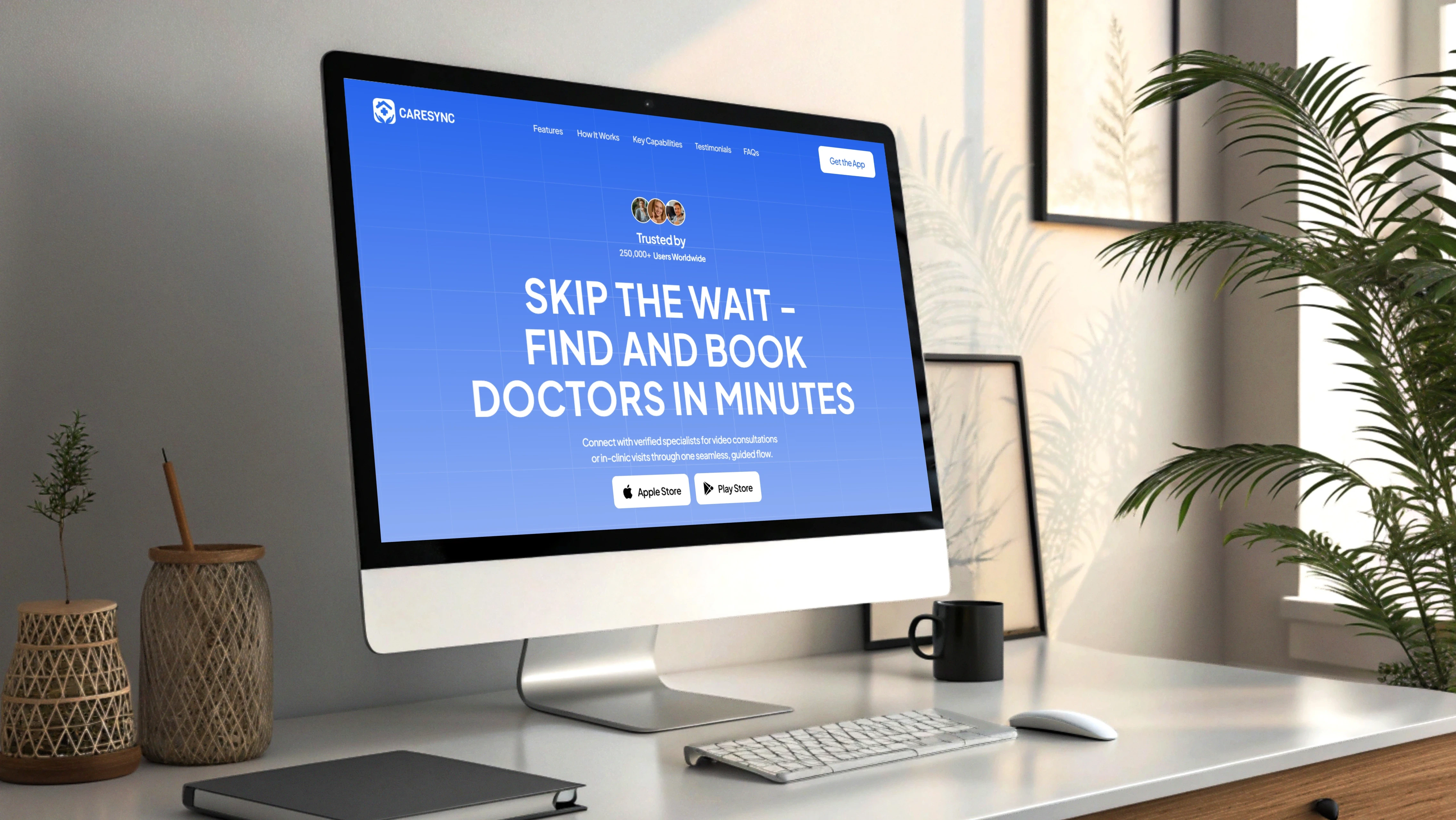
The page follows a single-scroll structure with anchored navigation: Features, How It Works, Key Capabilities, and Testimonials. Content flows from broad value to specific proof, opening with the hero and trust stats, moving through feature sections, a step-based process, testimonials, and a closing download call to action, matching how users typically evaluate an unfamiliar app.
Key Features
Progressive Feature Sections
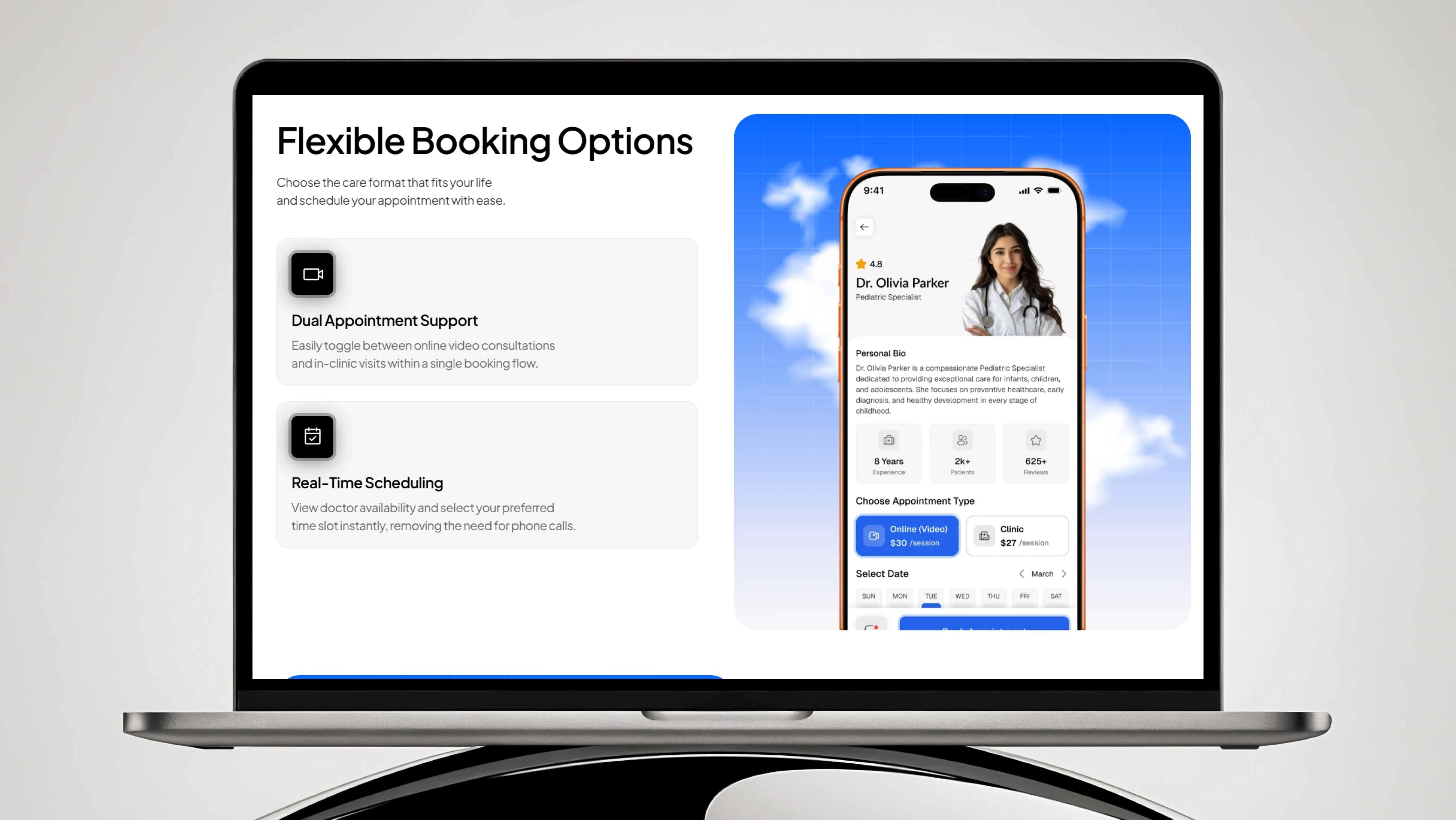
Each app capability is paired with a phone mockup and short copy. This lets users absorb one idea at a time, reducing overload while clearly demonstrating how the app looks and behaves in practice.
Trust and Social Proof
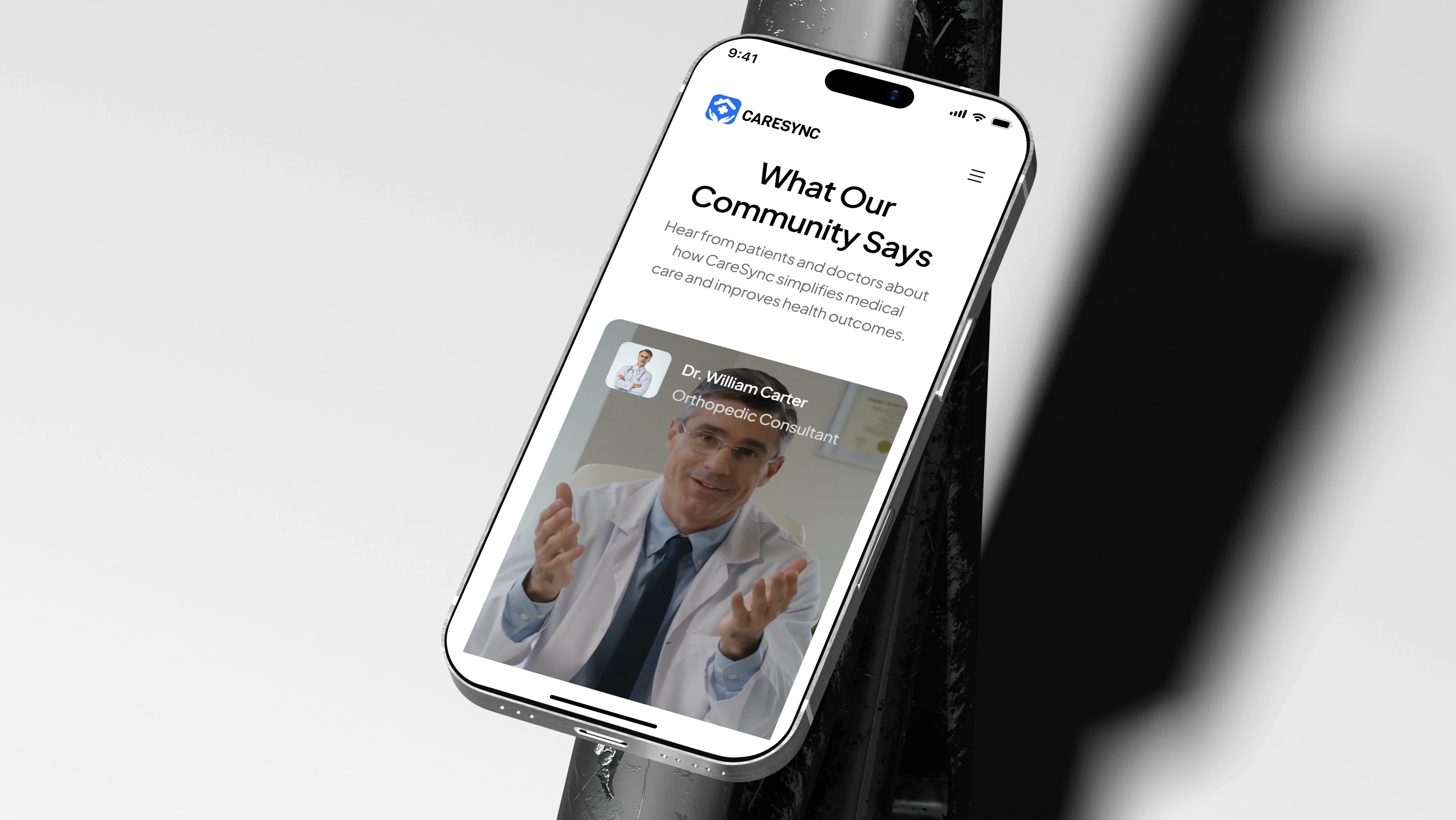
A statistics bar and a community testimonial section surface credibility early. Real-context doctor imagery and user counts help hesitant visitors feel confident before downloading a healthcare product.
Step-Based "How It Works"
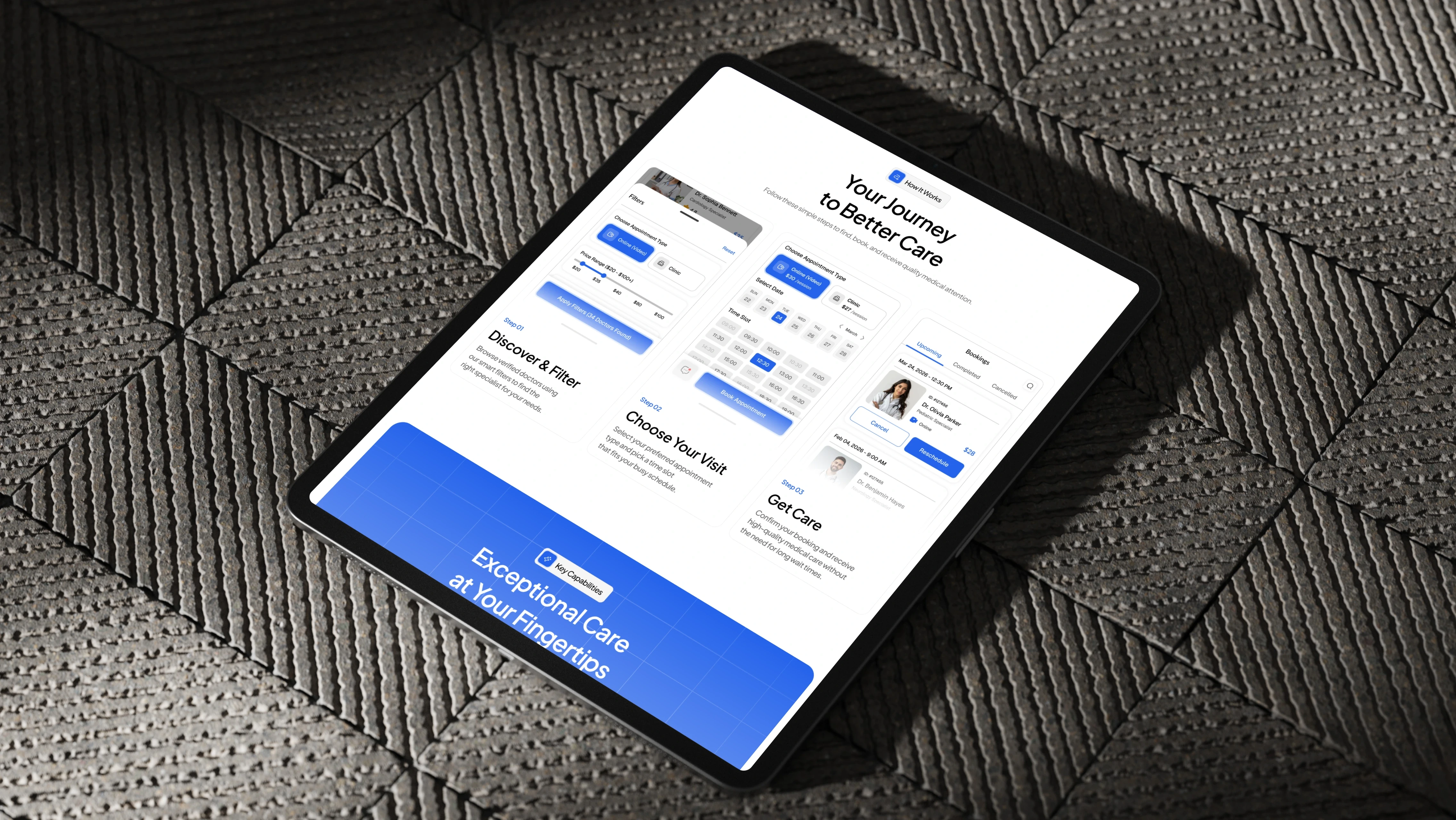
A three-step journey (Discover, Choose, Get Care) simplifies the app's flow into a scannable overview, setting accurate expectations before install and reducing post-download confusion.
Repeated Download CTAs
App Store and Play Store buttons appear in the hero and footer, keeping the primary action available at natural decision points without forcing users to scroll back.
UX Decisions
I used a consistent alternating layout, mockup on one side, text on the other, to create rhythm and keep long-form scrolling comfortable. Section headings are short and benefit-led so users can skim without reading every line. Device mockups do the heavy lifting for feature communication, letting copy stay minimal. A single blue accent marks every primary action, so download and navigation cues stay predictable throughout the page. For the template use case, I kept each section modular and self-contained, allowing teams to remove or reorder blocks without breaking the visual flow.
Visual Design
The page carries over the app's calm blue-and-white palette for brand continuity, using a bold gradient hero to anchor attention. A clean sans-serif typeface with strong size contrast separates headlines from supporting text, keeping dense sections readable. Realistic device mockups on desktop, tablet, and phone frames present the UI in believable contexts, adding credibility. Generous white space and consistent section padding create a measured, professional pace, while a single accent color keeps calls to action visually distinct against neutral backgrounds.
Challenges & Solutions
Challenge: Presenting many app features on one page without it feeling long or repetitive.
Solution: I alternated mockup placement and used progressive, single-idea sections, giving each feature breathing room while maintaining a steady scrolling rhythm.
Challenge: Making the page reusable for other apps, not just CareSync.
Solution: I built modular, self-contained sections with clear placeholder content and imagery, so teams can swap visuals and copy without disrupting layout or spacing.
Accessibility Considerations
High-contrast blue CTAs against light backgrounds for legibility.
Large, clearly spaced touch targets for download buttons and navigation.
Consistent typographic hierarchy supporting quick scanning.
Responsive layouts tested across desktop, tablet, and mobile.
Generous spacing to keep sections distinct and reduce visual clutter.
Outcome
The final landing page presents CareSync as a trustworthy, easy-to-understand product before download. Visitors move through a clear narrative, from value proposition to feature proof to a direct call to action, without friction. As a template, the modular structure lets other app teams launch a comparable page quickly by replacing content and mockups, making the design both purpose-built and broadly reusable.
Key Learnings
Device mockups can carry most of the communication load, letting copy stay short and scannable.
Placing trust signals early improves confidence for sensitive products like healthcare.
Designing for reuse forced cleaner, more modular section structures than a one-off page would have.
Next, I'd validate CTA placement and section order through analytics or A/B testing.