

Mayank Desai
UI/UX Designer & Framer Developer
Share On




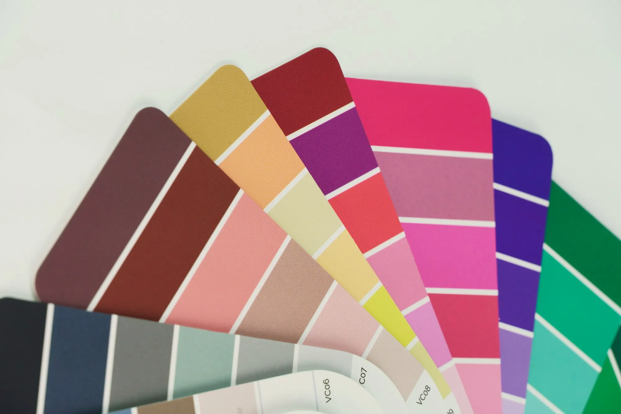
Every pixel on a screen communicates something, but nothing communicates faster than color. Before a user reads a single word of your interface copy, before they parse a navigation label or evaluate a layout grid, color has already shaped their emotional response. It has told them whether your product feels premium or playful, trustworthy or experimental, calm or urgent. Yet for many designers working in UI/UX design, color selection remains one of the most intuitive and least systematic parts of the design process - a place where gut feeling substitutes for strategy. This article presents 10 carefully curated two-tone color combinations drawn from a professional palette guide, examines the psychology and contrast logic behind each pairing, and offers a practical framework for integrating deliberate color strategy into your product design workflow.
The Psychology Behind Two-Tone Palettes: Why Less Is More
There is a reason the most iconic brands in the world can be identified by just two colors. Think of the immediate recognition triggered by a specific red and white, or a particular blue and yellow. Two-tone palettes work because they create a binary visual system that the brain processes effortlessly: one color establishes the dominant mood, the other provides contrast, emphasis, and hierarchy. In UI/UX design, this simplicity translates directly to usability. When your interface is built on a disciplined two-color foundation - expanded only with tints, shades, and a neutral scale - users can parse visual hierarchy intuitively. Primary actions stand out. Content areas feel organized. The cognitive load drops.
Research in color psychology confirms that hue carries emotional weight long before conscious interpretation begins. Warm tones like reds, coppers, and wines activate energy, urgency, and appetite. Cool tones like teals, violets, and muted greens signal calm, trust, and stability. Neutrals like ivory, smoke, and almond create breathing room - they are the negative space of color. A two-tone palette is not a limitation; it is a design strategy that forces clarity of intent. Every color in your interface should have a job. With two tones, there is nowhere to hide a lack of purpose.
The 10 combinations presented in this guide are built on this principle. Each pairing consists of one dominant tone and one accent, carefully calibrated for contrast, emotional resonance, and versatility across light and dark contexts. Let us examine them in detail.
The 10 Palettes: Anatomy of Each Combination
What follows is not just a list of pretty colors. Each pairing is analyzed for its contrast ratio, emotional register, and practical application in product design contexts. The goal is to help you see color not as decoration but as functional communication.
Palette 1: Snow (#FCF7F8) + Madder (#A31621)
This is a high-impact, high-contrast pairing. Snow is not pure white - it carries the faintest blush of warmth, which softens the harshness of a true #FFFFFF background while maintaining near-maximum lightness. Madder is a deep, authoritative red with blue undertones that distinguish it from the more aggressive, orangey reds of fast food branding. Together, they produce a palette that feels editorial, bold, and refined. In a UI context, Snow provides the expansive canvas while Madder works as the call-to-action color, error state, or brand accent. The contrast ratio between these two sits comfortably above WCAG AA standards for large text, making this combination both visually striking and accessible. Think premium editorial platforms, fashion e-commerce, or any product where confident sophistication is the brand emotion.
Palette 2: Dutch White (#EFDFBB) + Wine (#722F38)
Dutch White is a warm, wheat-toned neutral with a golden undertone - significantly warmer than standard off-whites and closer to parchment. Wine is a muted, browning red that carries depth without aggression. This is a heritage palette. It evokes craft, warmth, and artisanal quality. The combination feels immediately at home in food and beverage apps, boutique hospitality platforms, or any product design project where the brand story involves tradition, craftsmanship, or natural materials. In Figma, you might extend this duo by deriving a mid-tone from their average for secondary UI surfaces, and pulling a near-black from Wine's darkest shade for body text.
Palette 3: Sea Mist (#DFE8E7) + Burnt Copper (#A0430A)
Sea Mist is a cool, desaturated blue-green that reads as a sophisticated gray in many contexts. Burnt Copper is an earthy, oxidized orange that feels grounded and material - less digital, more physical. This pairing creates an unusual tension between cool serenity and warm earthiness that feels distinctly modern. It is well suited for architecture portfolios, sustainable product brands, home goods e-commerce, or wellness apps where the user experience should feel grounded and tactile. The design strategy here is to let Sea Mist dominate (70-80% of surfaces) and use Burnt Copper sparingly - buttons, highlighted links, active tab indicators - so its warmth pops against the cool expanse.
Palette 4: Soft Ivory (#F0E9E1) + Tropical Teal (#0F9E9A)
This is arguably the most versatile combination in the set. Soft Ivory is the quintessential warm neutral - elegant, approachable, and invisible in the best sense. Tropical Teal is a saturated, blue-leaning green that is energetic without being aggressive, friendly without being childish. This pairing appears across a broad spectrum of modern SaaS products, health-tech interfaces, and fintech dashboards precisely because it balances professionalism with approachability. The teal reads as trustworthy (the psychological territory of blue) while carrying the freshness and growth connotation of green. In your creative workflow, this combination is a safe bet when designing for broad audiences.
Palette 5: Light Almond (#EEE5DA) + Deep Charcoal (#262425)
Strip away all chromatic color and you arrive at the fundamental contrast pair: a warm light against a near-black dark. Light Almond avoids the clinical coldness of pure gray backgrounds, while Deep Charcoal avoids the optical harshness of true black (#000000), which can cause halation effects on bright screens. This is the workhorse palette - suitable for typography-driven sites, long-form reading experiences, portfolios, and minimalist design systems. In practice, this combination is the foundation that every other palette builds upon. Even if you adopt the Snow + Madder combination from Palette 1, you will almost certainly need a near-black for body text and a warm neutral for secondary surfaces. Light Almond and Deep Charcoal are those functional anchors.
Palette 6: White Smoke (#F7F4F3) + Wine (#5B2333)
This is a subtler, more restrained variation on the Snow + Madder pairing. White Smoke sits a few degrees warmer and a touch darker than Snow, creating a background that feels like expensive paper. This particular Wine - #5B2333 - is darker and more purple-shifted than Palette 2's Wine (#722F38), leaning toward plum territory. The result is a moodier, more intimate combination that works beautifully for luxury product design, evening-event platforms, cultural institutions, or any context where understated elegance is the goal. The contrast ratio here is excellent for large text and headings but should be verified for small body text - consider pulling Wine slightly lighter for paragraph copy to maintain WCAG compliance.
Palette 7: Sun (#EEEEEE) + Fire Opal (#F05053)
Sun is a pure, neutral light gray - no warm or cool bias, just clean luminance. Fire Opal is a vibrant, coral-leaning red that pulses with energy. This is the most energetic combination in the entire set. It demands attention. It is designed for interfaces that need to drive action: fitness apps, flash sale platforms, notification-heavy dashboards, gaming UIs, or any product where the user experience is built around urgency and engagement. Use Fire Opal with extreme intentionality - if it appears everywhere, it ceases to be an accent and becomes noise. Reserve it for primary CTAs, critical alerts, and the single most important interactive element on any given screen.
Palette 8: Mint Green (#D6FFF6) + Russian Violet (#231651)
This is a high-contrast, high-personality pairing that immediately signals creativity and confidence. Mint Green is a cool, saturated pastel that carries significant visual energy despite its lightness. Russian Violet is a deep, inky blue-purple that functions as a sophisticated alternative to black. Together, they produce a palette that feels futuristic, slightly unconventional, and distinctly digital-native. This combination excels in creative agency portfolios, music or entertainment platforms, Web3 and blockchain product interfaces, and any design strategy that aims to feel forward-looking. The contrast ratio between Mint Green background and Russian Violet text is strong, but accessibility testing is essential because the green's saturation can create readability challenges for some users with color vision deficiencies.
Palette 9: Hunter (#FFFCDC) + Dark Green (#14281D)
Hunter is a soft, buttery yellow - barely there but unmistakably warm. Dark Green is a deep, near-black forest tone that feels organic and grounded. This combination is nature in two colors. It is tailor-made for sustainability-focused brands, organic food platforms, outdoor and adventure products, or eco-conscious fintech. The warmth of Hunter prevents Dark Green from feeling heavy or foreboding, while Dark Green grounds Hunter and prevents it from reading as sickly or unfinished. In your design process, extend this palette with a mid-range sage green derived from Dark Green at 40% lightness to create a three-tier hierarchy that still feels cohesive.
From Palette to System: Turning Two Colors Into a Complete Design Language
A two-tone palette is a starting point, not a finished system. To translate any of the 10 combinations above into a production-ready design language, you need to expand them systematically. Here is the process that professional product design teams follow.
Step 1: Generate a tonal scale. Take each of your two base colors and generate a 10-step lightness scale (50 through 950, borrowing the Tailwind CSS convention). For Tropical Teal (#0F9E9A), this means creating progressively lighter tints up to a barely-there wash, and progressively darker shades down to near-black. You now have 20 values instead of two, all harmonically related. In Figma, you can accomplish this using variables and the built-in color adjustment tools, or through plugins like the Figma Tokens plugin that automate scale generation.
Step 2: Assign semantic roles. Raw HEX values are not useful to a development team. Map your tonal scale to semantic tokens - names that describe function, not appearance. Your base teal becomes color/primary/default. Its lighter tints become color/primary/subtle, color/primary/surface, and color/primary/hover. Its darker shade becomes color/primary/pressed. Repeat for your second color and for a neutral scale derived from your warm or cool base. This is the bridge between design strategy and engineering implementation.
Step 3: Apply the 60-30-10 proportion rule. This principle, borrowed from interior design and widely adopted in UI/UX design, dictates that your dominant color (typically the lightest neutral) occupies roughly 60% of visual space, your secondary color takes 30% (backgrounds, cards, containers), and your accent - the one carrying the most chromatic energy - occupies just 10% (CTAs, active states, key indicators). For the Soft Ivory + Tropical Teal palette, this means Soft Ivory and its tints fill most surfaces, a mid-ivory or warm gray handles secondary containers and borders, and Tropical Teal appears only where you want the user's eye to land.
Step 4: Validate for accessibility. Every color pair that involves text must meet WCAG 2.1 contrast requirements. Use tools like the contrast checker built into Adobe Color, the Stark plugin for Figma, or WebAIM's online tool. Pay particular attention to your accent color on light backgrounds - many vibrant teals, corals, and greens that look beautiful on a swatch fail miserably at 14px body text. Adjust the shade, not the hue, to fix this. Darken or lighten as needed while keeping the chromatic identity intact.
Common Color Mistakes in UI/UX Design and How These Palettes Avoid Them
Even with a well-chosen palette, implementation mistakes can undermine the user experience. Here are the most common pitfalls and how the palettes in this guide are designed to sidestep them.
Mistake 1: Using too many colors. This is the most pervasive error in UI/UX design, especially among early-career designers. Every additional color introduced to a layout competes for attention and dilutes the hierarchy. The two-tone constraint of these palettes is itself the solution - it enforces discipline. If your interface needs a success state (green), an error state (red), and a warning state (yellow), treat those as functional system colors that live outside your brand palette, and keep them desaturated enough that they don't clash with your primary duo.
Mistake 2: Ignoring the warm-cool relationship. Each of these 10 palettes pairs a warm tone with a cool one, or a warm neutral with a chromatic accent. This is intentional. Monochromatic palettes (e.g., two different blues) can work, but they demand far more skill to execute because the contrast between elements relies entirely on lightness, not temperature. By pairing a warm base with a cool accent - like Soft Ivory with Tropical Teal - you create natural visual separation that makes interactive elements pop against content surfaces without requiring extreme lightness differences.
Mistake 3: Choosing colors in isolation from context. A HEX code in a swatch looks different than that same HEX code rendered at 14px over a textured photograph, next to a saturated illustration, or on a mobile screen at full brightness in direct sunlight. Always test your palette in context. Drop your chosen combination into a realistic UI mockup - a settings screen, a checkout flow, a data table - and evaluate it across multiple screen types. Figma's device preview feature and the Mirror app are essential for this step.
Mistake 4: Forgetting dark mode. Every one of these palettes was presented as a light mode pairing, but in 2026, shipping without a dark mode option is increasingly unacceptable. The good news is that two-tone palettes adapt well to dark mode when you invert the relationship thoughtfully. Your light neutral becomes a dark surface (not pure black - a dark tinted version of your warm neutral, like a darkened Soft Ivory at around #1A1816). Your accent color typically needs to be lightened by one or two steps to maintain contrast and reduce eye strain on dark backgrounds. Material Design's guidelines recommend using the 200-level tint of your primary color in dark mode rather than the base value.
Mistake 5: Relying solely on color to communicate meaning. Approximately 8% of men and 0.5% of women have some form of color vision deficiency. If your interface uses Fire Opal (#F05053) as the only indicator that a field has an error, a meaningful subset of your users will miss it entirely. Always pair color with a secondary indicator - an icon, a text label, an underline, a pattern. This is not just an accessibility best practice; it is a fundamental product design principle that improves clarity for all users, even those with full color vision.
Applying Color Strategy in Figma: A Practical Walkthrough
Theory matters, but execution happens in the tool. Here is how to translate any of these 10 palettes into a production-grade color system inside Figma, the design tool that has become the default environment for most product design teams.
Setting up primitive variables. Open your Figma design system file and navigate to the Variables panel (accessible from the right sidebar or via the main menu). Create a new variable collection called "Primitives/Color." Inside it, define your two base colors and their tonal scales. For example, if you are implementing Palette 4 (Soft Ivory + Tropical Teal), you would create variables named ivory/100 through ivory/900 and teal/100 through teal/900, each containing the appropriate HEX value. Add a neutral scale (neutral/100 through neutral/900) derived from a desaturated blend of your base tones. These primitive variables are your single source of truth - raw color values that should never be directly applied to frames or components.
Creating semantic tokens. In a second variable collection called "Semantics/Color," create variables that reference your primitives. The variable bg/surface/primary might point to ivory/100. The variable text/primary might point to neutral/900. The variable interactive/default might point to teal/500. The variable interactive/hover might point to teal/600. This indirection is what makes your system scalable: if a stakeholder asks you to shift the brand teal slightly bluer, you change one primitive value and every semantic token that references it updates across the entire file.
Enabling dark mode with variable modes. Figma's variable modes allow you to define alternate values for the same semantic token. Under the "Semantics/Color" collection, add a second mode called "Dark." Now, bg/surface/primary in Light mode points to ivory/100, but in Dark mode it points to neutral/900. text/primary in Light mode points to neutral/900, but in Dark mode it points to ivory/100. interactive/default in Light mode is teal/500, and in Dark mode it shifts to teal/300 for better contrast on dark surfaces. Apply the variable collection to a top-level frame, switch its mode between Light and Dark, and watch every child component recolor instantly. This is the power of a systematic creative workflow - minutes instead of hours.
Testing and documentation. Build a dedicated page in your Figma file called "Color System" that displays every semantic token alongside its primitive reference, its HEX value in both modes, and its WCAG contrast ratio against the most common background it will sit on. This page is not just documentation for your engineering partners - it is a forcing function that makes you confront any accessibility gaps before they reach production.
AI-Augmented Color Selection: Where the Field Is Heading
The intersection of AI in design and color strategy is one of the most active areas of tooling innovation in 2026. We have already seen tools like Khroma use machine learning to generate personalized palettes, and Coolors introduce AI-powered suggestions that analyze your locked colors and recommend harmonious completions. But the frontier is moving further.
Generative AI models trained on large datasets of successful interfaces are beginning to suggest not just color palettes but entire color systems - complete with semantic assignments, contrast-verified pairings, and dark mode inversions. Figma's own AI features are exploring context-aware color suggestions, where the tool analyzes your layout structure and recommends which semantic token to apply to which element. Adobe's Firefly ecosystem is integrating color extraction from generated images back into Creative Cloud libraries, creating a feedback loop where visual concepts and systematic color tokens converge.
Yet the core human judgment remains irreplaceable. An AI can calculate that Russian Violet (#231651) paired with Mint Green (#D6FFF6) achieves a contrast ratio of 12.4:1. It cannot tell you whether that combination resonates with the emotional positioning of a meditation app versus a gaming platform. That decision - the translation of brand strategy into chromatic expression - remains the domain of the product designer. The most effective creative workflow in 2026 is one where AI handles the combinatorial and computational heavy lifting (generating scales, checking contrast, suggesting harmonies) while the human designer makes the editorial and strategic choices (which emotion, which hierarchy, which story).
Key Takeaways
Color is not ornament. It is infrastructure. The 10 two-tone combinations explored in this article - from the editorial authority of Snow + Madder to the organic warmth of Hunter + Dark Green - are not just aesthetically pleasing pairings. They are starting points for complete color systems that, when expanded through tonal scales, assigned semantic roles, validated for accessibility, and implemented through Figma variables, become the connective tissue between brand strategy and user experience. The discipline of a two-tone palette forces you to justify every color decision, to understand the emotional job each hue performs, and to build systems rather than one-off screens. Whether you are a solo product designer defining a startup's first design language or a senior practitioner refining an enterprise design system, the principle holds: start with two intentional colors, expand systematically, test rigorously, and let every pixel earn its place.
Quick Reference: All 10 Palettes
# | Light Tone | HEX | Dark/Accent Tone | HEX | Best For |
|---|---|---|---|---|---|
1 | Snow | #FCF7F8 | Madder | #A31621 | Editorial, fashion, premium brands |
2 | Dutch White | #EFDFBB | Wine | #722F38 | Hospitality, artisan, food & beverage |
3 | Sea Mist | #DFE8E7 | Burnt Copper | #A0430A | Architecture, sustainability, home goods |
4 | Soft Ivory | #F0E9E1 | Tropical Teal | #0F9E9A | SaaS, health-tech, fintech |
5 | Light Almond | #EEE5DA | Deep Charcoal | #262425 | Typography-first, portfolios, minimalism |
6 | White Smoke | #F7F4F3 | Wine | #5B2333 | Luxury, culture, evening events |
7 | Sun | #EEEEEE | Fire Opal | #F05053 | Fitness, gaming, urgency-driven UIs |
8 | Mint Green | #D6FFF6 | Russian Violet | #231651 | Creative agencies, Web3, entertainment |
9 | Hunter | #FFFCDC | Dark Green | #14281D | Sustainability, organic, outdoor brands |
Color is a conversation between your product and your user. Make sure you know what you are saying.